Plant Care Through Observation
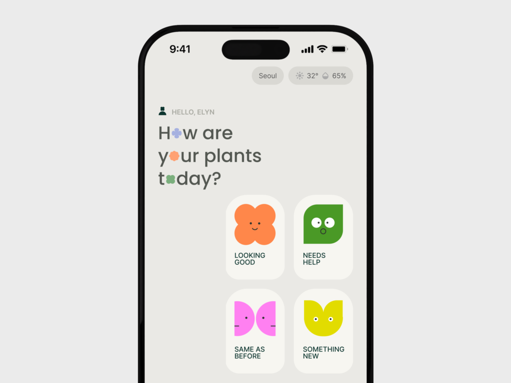
This project was created independently to explore and validate a product concept rather than build a production-ready application.
Problem
I didn’t start this project from a deep interest in plants.
It began as part of the Google UX Design course. As I was just entering product design, plant care felt like the most approachable theme to start with.
To understand the space, I explored existing plant care apps and discovered that users still experience issues with diagnosis functions.
Most apps try to reduce uncertainty through diagnosis features, often combining them with plant identification. Some guide users through multi-angle photo capture and additional inputs to improve accuracy.
However, across the apps I observed, the same issue kept appearing: users reported inconsistent results, incorrect diagnoses, and care advice that sometimes worsened plant conditions.
Initially, I treated this as a UX problem—unclear flows or insufficient guidance for capturing photos.
Reframing the problem

Plant health cannot be understood from a single moment.
Through further research, I realized the issue was not only UX—it was attempting certainty from incomplete context.
Plant health depends on change over time, not a snapshot.
- Plants vary by age, light, season, and environment.
- Visually similar symptoms can have different causes.
- Even experienced growers avoid single-image judgments.
Limits of diagnosis
Diagnosis systems reduce uncertainty by providing a clear result. The flow feels complete, making that result seem more certain than the available information can support.
Capture → Analysis → Result
- The experience suggests that taking a better photo will produce a more accurate answer.
Example: “Move closer” or “Take another photo for better accuracy.”
- The diagnosis is based on a single image without the plant’s recent context.
For example, the app analyzes one photo but doesn’t know what the plant looked like yesterday, its watering history, lighting conditions, or recent changes.
Despite those missing pieces, it may display: “Overwatering detected.” instead of something like: “Based on this image, overwatering is one possible explanation.”
The problem is not diagnosis itself, but the amount of context available. A single photo captures only one moment, making it difficult to understand how a plant has changed over time.
The shift from diagnosis to observation
Existing and potential users
Since plant diagnosis apps are primarily used by beginners and plant-curious users, I interviewed these groups and analyzed app store feedback. And three key insights emerged.
1. Fear of making mistakes
Users acted from uncertainty—overwatering, underwatering, or missing early signs.
2. Emotional attachment
Plants were described as relationships, not objects.
“I feel connected with my plants when I sit in the sunlight with them.”
“They relax me when I see them.”
“I think of my plants like my babies.”
3. People don’t seek experts first
When problems appeared, users rarely went straight to experts. They often didn’t consider the problem urgent or serious enough to seek expert help, so they asked friends, searched online, or checked communities first.
Despite this, most apps positioned themselves as authoritative answer systems.
People who don’t rely on apps
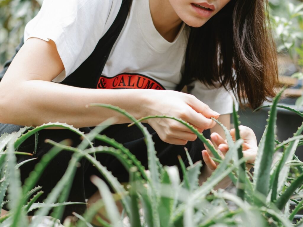
To better understand plant care beyond apps, I also looked at how experienced gardeners care for their plants.
What stood out wasn’t knowledge—it was attention.
They:
- Observed continuously
- Noticed subtle changes
- Adjusted based on patterns rather than fixed schedules
“It feels dry today. I’ll wait one more day.”
Rather than following rules, they responded to what they observed over time.
Plant care became less about following rules and more about observing how plants responded to their environment over time. Over time, this built confidence, familiarity, and attachment.
Product direction
The research shifted the focus away from diagnosis and toward confidence through observation.
Instead of answering:
“What is wrong with my plant?”
The product supports:
“What is changing over time?”
By making a plant’s story visible over time, users can:
- Bring previous moments into the current view
- Compare past and present states
- Compare their own with external stories
What this provides
- More context around the current state
- Better understanding of changes over time
- A stronger sense of connection and attentiveness
Over time : Observation → History → Context → Confidence
This also meant moving away from optimizing for diagnosis, plant identification, or expert-like prescriptions. This product focuses on helping users build understanding through observation and context over time.
The goal is not to tell users what’s wrong with their plants.
It’s to help them understand their plants better.
Monetization Model
As the product shifted from diagnosis to accumulated context, it raised a monetization question:
If the value comes from context rather than answers, what should users actually pay for?
Charging for diagnoses didn’t feel right. The product’s value wasn’t in answers, but in the context built over time.
At this stage, the observation approach had not yet been fully validated, but I wanted to explore whether the direction could also create business value.
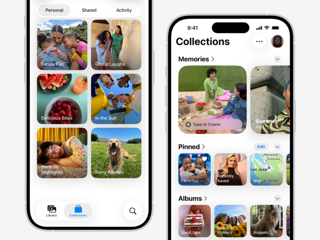
The idea became clearer when I thought about how iOS Photos works. People technically pay for storage, but storage alone is not what makes Photos valuable. Features like Memories, People & Pets, and contextual search help users make sense of everything they’ve already captured.
The value comes from organizing accumulated history, not simply storing it.
The same principle applies to this product.
Free
If the product’s value is context, then continuity and relationship-building remain free.
- Full timeline
- Bring previous moments
- Photos and notes
- Logged care actions
- Community access
Paid
The paid layer focuses on organizing accumulated context. It doesn’t create new information. It reduces the cognitive load of understanding information that already exists.
- Phase-based timelines (stress, stability, recovery)
- Brought in previous moments (you saw something similar / your moments tell)
- Long-term context preservation
- Story filtering
- More plants over time
Continuity remains free. Organization becomes the paid value.
Building Context Over Time
A plant’s history becomes more meaningful over time, but new users start without enough context of their own. The product needed to support understanding from the beginning while allowing personal context to develop.
This led to two layers of context:
External patterns come from existing plant knowledge and shared experiences. They provide reference points before users have enough personal history to recognize patterns themselves.
Example: Yellowing often appears 5–7 days after relocation.
These patterns provide context for observation, not definitive answers.
Internal patterns come from a user’s own plant history.
By connecting past observations, care actions, and changes over time, the system helps users recognize relationships specific to their plants.
External Knowledge + Personal History → Better Understanding
Final Logic
Each layer builds on the one before it:
Observation → History → Context → Structure → Confidence
- Free builds the foundation: observation and history
- Paid helps users organize and understand accumulated context through deeper views and summaries
The product is designed to help users understand their plants through observation over time.
Testing
I tested key assumptions with five participants and iterated prototypes.
Observation flow vs diagnosis flow
The product direction depends on users finding value in observation, so I tested this assumption before exploring other flows.
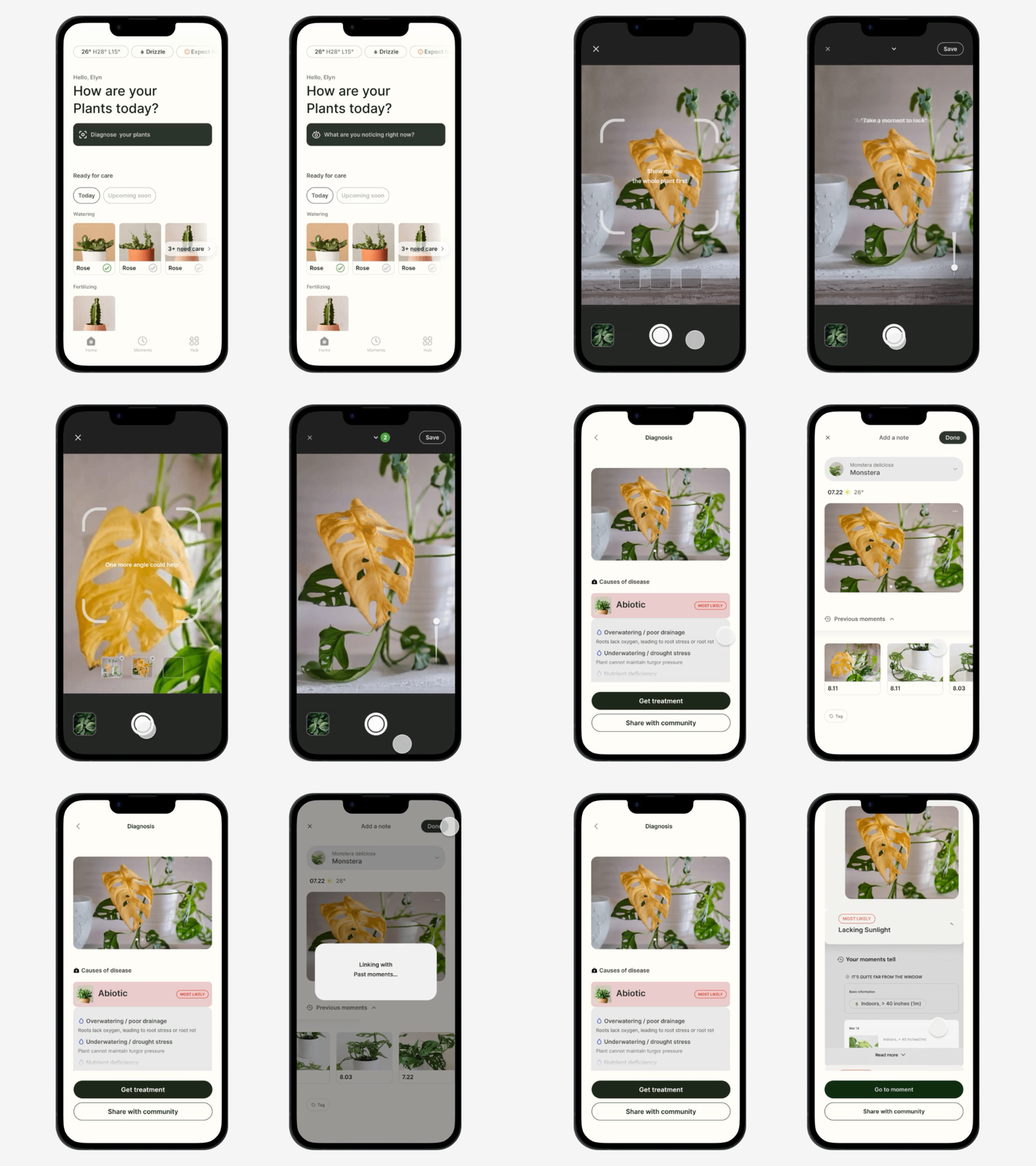
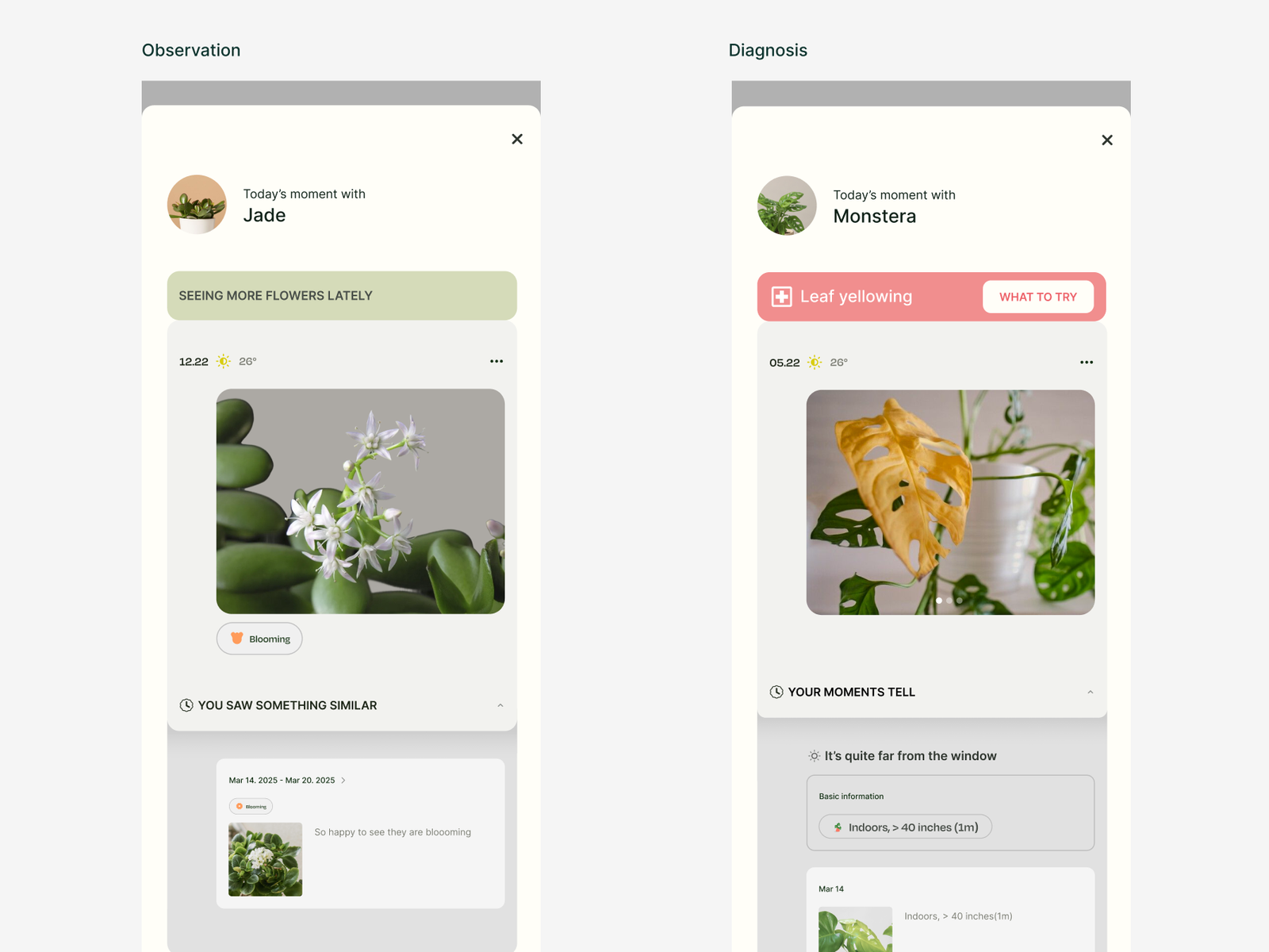
I compared two flows using a yellowing-leaf scenario.
The diagnosis flow:
- Scanning-based capture
- Diagnosis results
- Guidance frames
The observation flow:
- Removed guidance frames that hinder observation
- Added hidden frames to keep the focus on the plant itself
- Removed verdict-like outputs
- Added previous moments from the plant’s history

Result
Participants said observation flow felt spending time with plants, but preferred diagnosis because it provided immediate answers, direction, and reassurance.
Initially, this seemed to challenge the direction. After review, I realized the issue wasn’t the observation flow, but the scenario.
Yellowing leaves signal urgency, where users naturally want immediate guidance.
Earlier research showed that people usually don’t go to experts first because a plant problem doesn’t feel serious enough to warrant it. But the test revealed that not seeking expert help doesn’t mean they don’t want an answer. They can still want a quick sense of what’s going on.
“It’s not serious enough to ask an expert, but I still want to know what this is.”
That gave diagnosis a different role than I initially thought. Diagnosis gives beginners reassurance in the moment. It tells them they’re not completely in the dark about what’s happening. Observation serves a different purpose. It helps them understand how their plant changes over time.
So they serve different needs:
- Diagnosis for urgent, problem-solving moments
- Observation for noticing, documenting, and understanding change over time
Redirect
Rethinking the relationship between diagnosis and observation
I separated the scenarios: a blooming scenario for observation and a yellowing-leaf scenario for diagnosis when I retested the product. Previous moments were also included in the diagnosis results, just as they were in the observation flow, so users could understand the plant’s current condition within the context of how it had changed over time.
Yellowing immediately raises a question: “Is something wrong?” which make people naturally want an answer.
Blooming is different. I chose this scenario because it doesn’t create the same urgency as yellowing leaves.
It makes people think:
“Look what’s happening.”
So this time, it gave them a chance to experience observation without the pressure of having to solve an urgent problem.
Participants clearly distinguished when diagnosis was helpful and when observation was more appropriate. They also found revisiting previous moments meaningful.
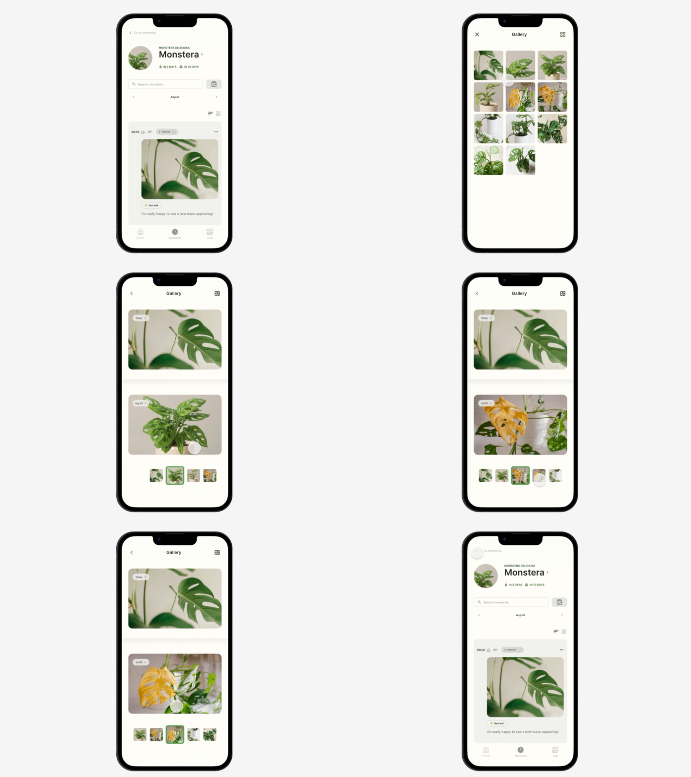
Comparison gallery
I also tested whether the comparison gallery could help users understand their plant’s history.
The current moment is shown at the top, with previous moments below, helping users compare the plant’s current state with its past.
Participants understood the plant’s progression by comparing past and present moments, which validated the value of the comparison gallery.
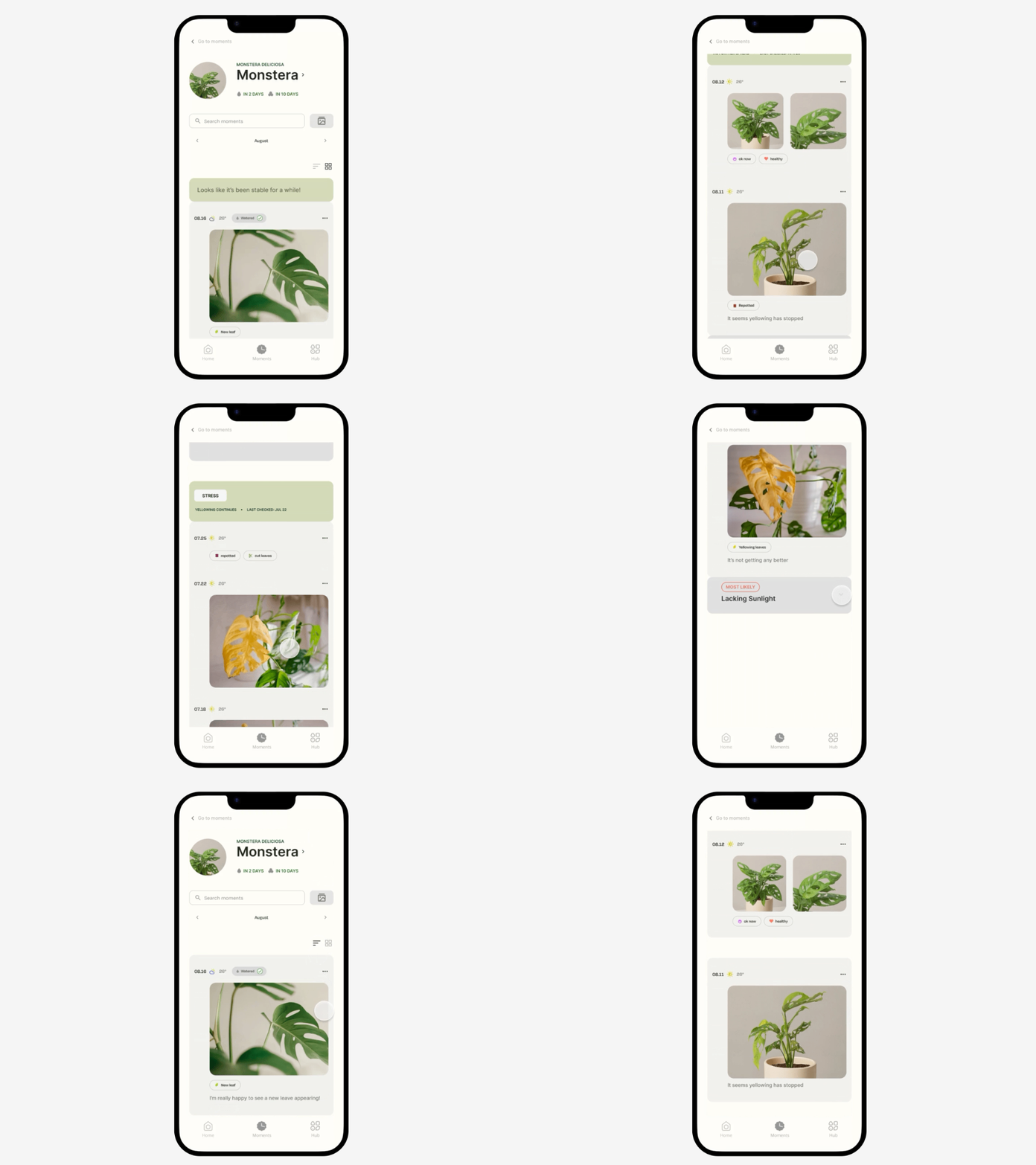
Original timeline vs Paid model
I was unsure whether the paid model (Phase-based timelines and previous moments attached to stories) created enough additional value beyond the original timeline.
I tested the original timeline, where users see their raw moments over time, against the paid model. Participants responded positively to both. Some participants mentioned that the paid model made it easier to understand what had happened over time. This showed that different structures can provide different values when exploring accumulated plant history.
So I decided to keep both views and allow users to switch between the original timeline and the paid model, preserving the value of each.
This test validated the value of the paid model, but not whether the added value is strong enough to justify a paid model. That would need to be validated in a separate monetization test.
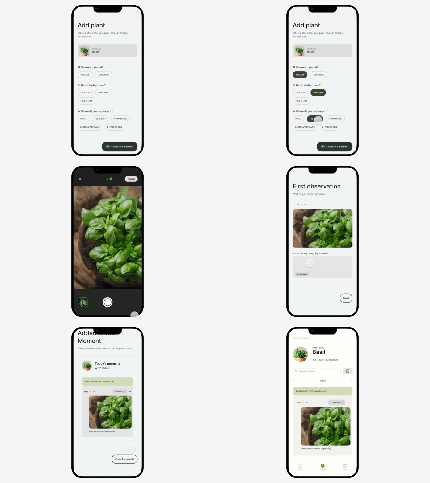
Onboarding
A key risk was conceptual clarity, given most plant apps focus on diagnosis. I introduced observation as the core behavior through the onboarding flow.
All participants understood the concept after onboarding, which gave me confidence to move forward with the direction.
Hub (community)
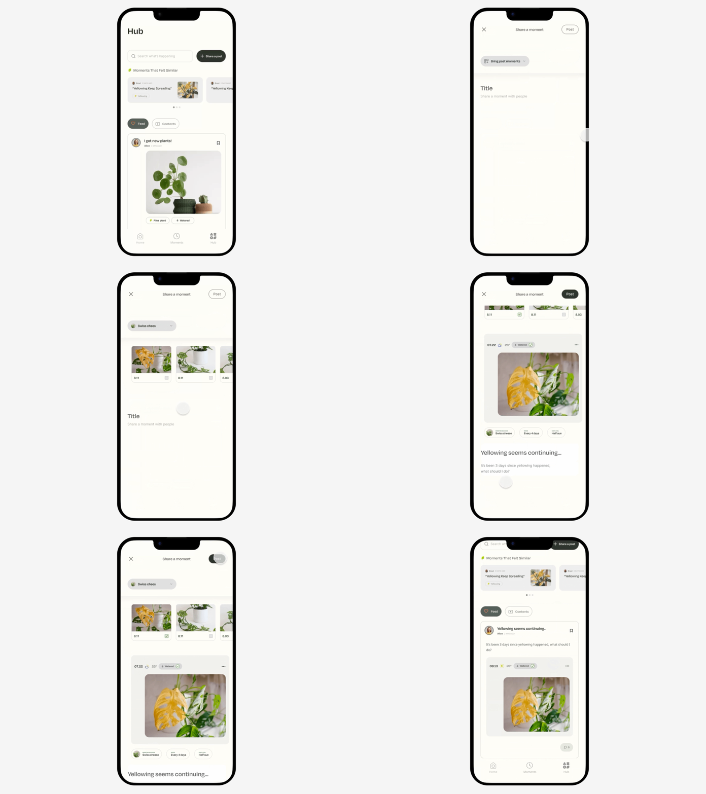
The prototype tested whether users could create a post smoothly using context and participants completed the flow without difficulty.
The Hub is where users share plant stories, ask questions, and learn from each other’s experiences. Because the product is built around context, I designed it to let users include previous moments when creating a post instead of starting from a blank page. This allows others to understand what happened before commenting.
I also introduced Moments That Felt Similar to create emotional continuity between Moments and the Hub, helping users feel understood.
The Hub isn’t just a place to ask questions. It’s a place to share plant stories, learn from other people’s experiences and see how those stories unfold over time.
Design decisions
Co-observing layer
I introduced co-observing companions to make plant care feel less overwhelming, especially for beginners who often worry about making mistakes.
Rather than acting as decorative characters, they appear at key decision points to create the feeling of observing the plant together.
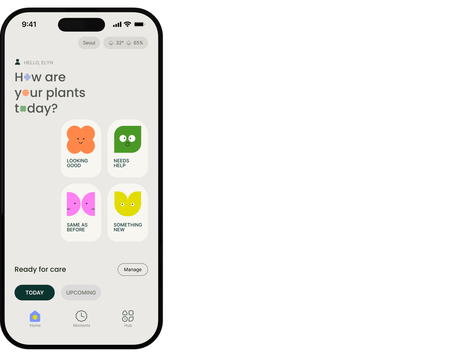
1. Capture entry points
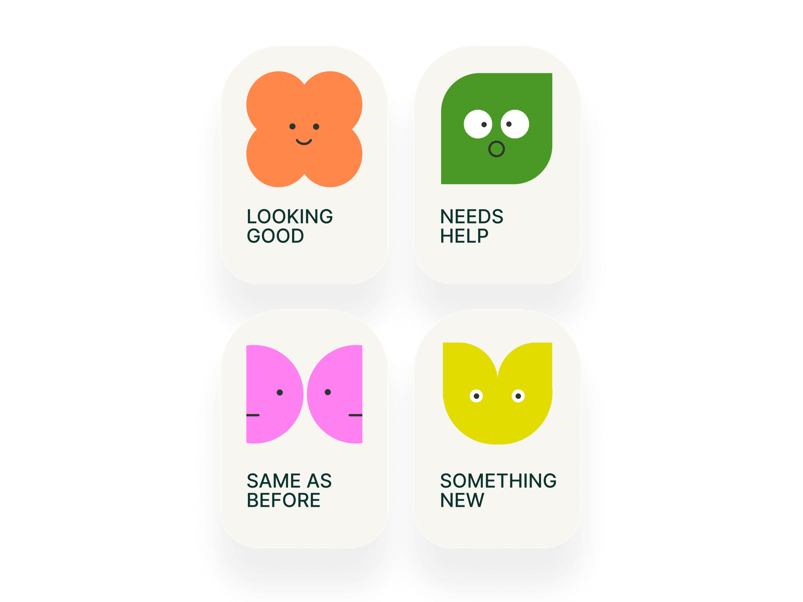
Core states:
- Looking good
- Need help
- Something new
- Same as before
Instead of acting as overlays on the capture entry points, the companions encourage observation before a story is recorded.
This shifts the interaction from simply selecting an option to noticing what is happening.
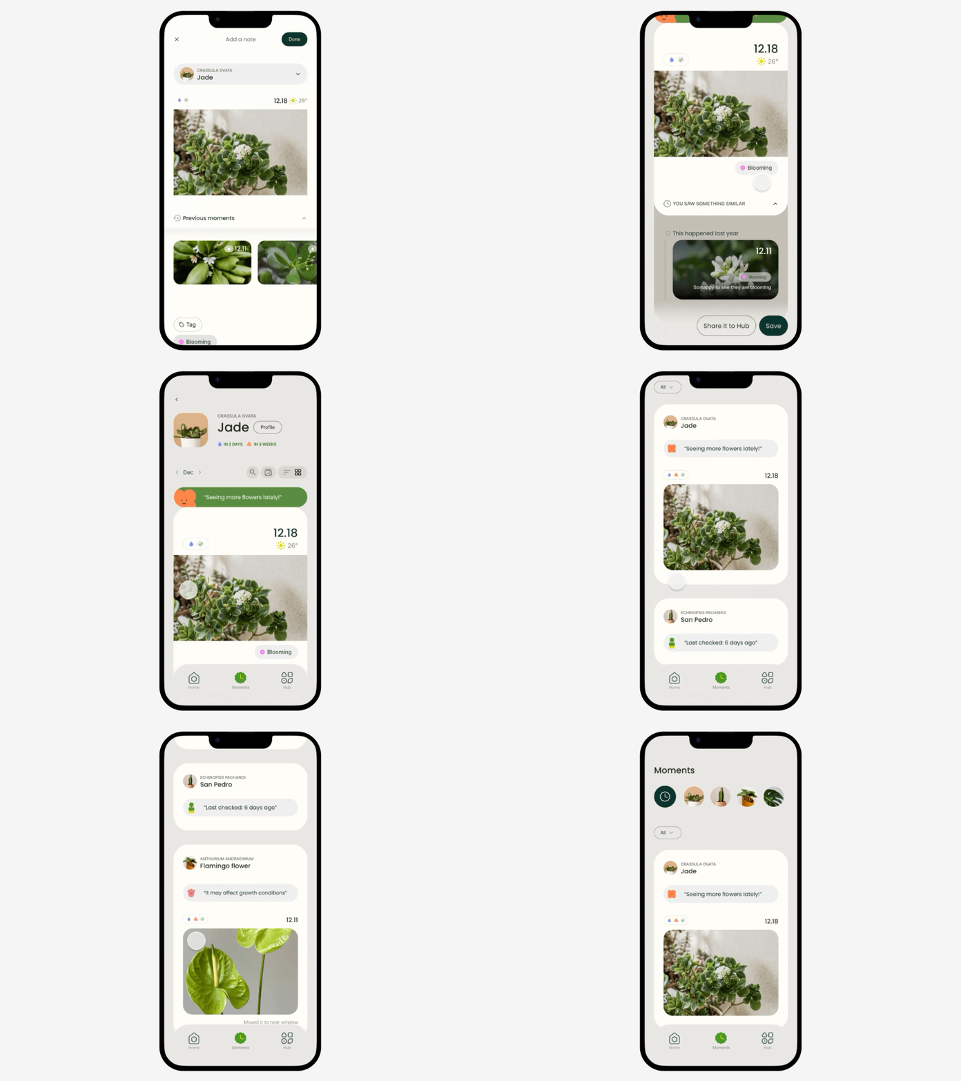
2. Plant current state
When users record a story, the system generates a plant state from user inputs and system signals. The generated plant state is shown on both each Plant page and the Moments(all plant collection) page helping users quickly understand their plant’s current condition.
Visual system
Corner radius system
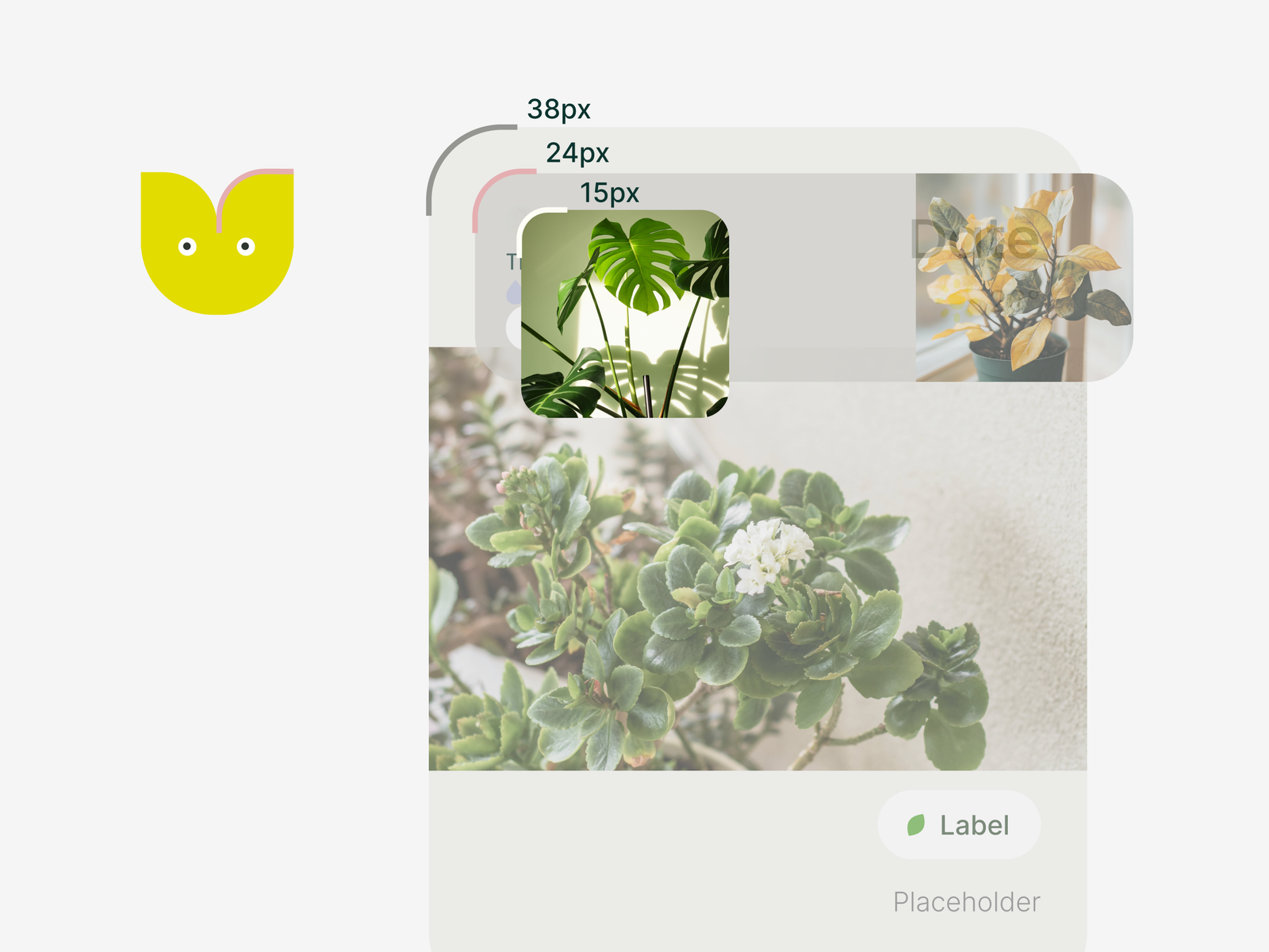
Because co-observing characters appear within cards, the radius system avoids nested elements with similar corner radii, which can blur visual hierarchy and create visual tension.
Characters (24 px) are placed inside containers with either a larger corner radius (38 px) or fully rounded forms, creating a clear distinction between the character and its container.
Mid-size cards echo the characters’ corner radius, while smaller components scale down using the same golden-ratio-based hierarchy.
- Character: 24
- Large cards: 38
- Mid cards: 24
- Small cards: 15
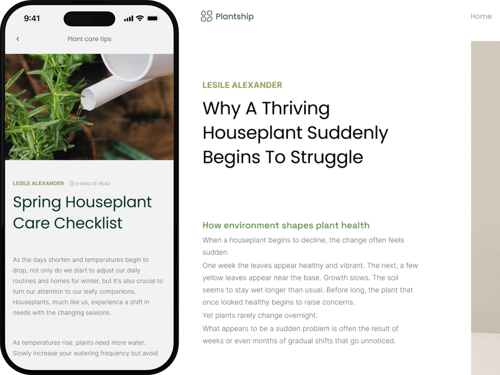
Typography
Typography with minimal character is chosen to balance expressive UI elements.
- Poppins: headings
- Inter: body and labels
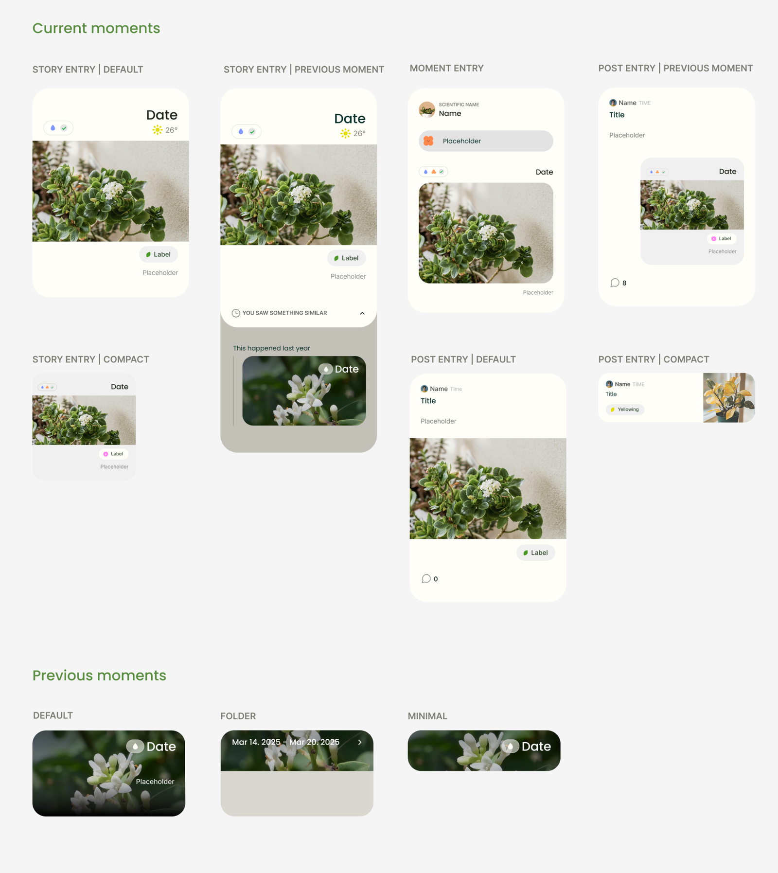
Card system
The interface is built around a unified card system spanning present and past states.
The primary view represents the current plant state. Previous moments exist within the same structure as expandable states. It is not a separate layer, but a continuation of the same system.
This preserves continuity across time, allowing users to move between moments without changing mental models.
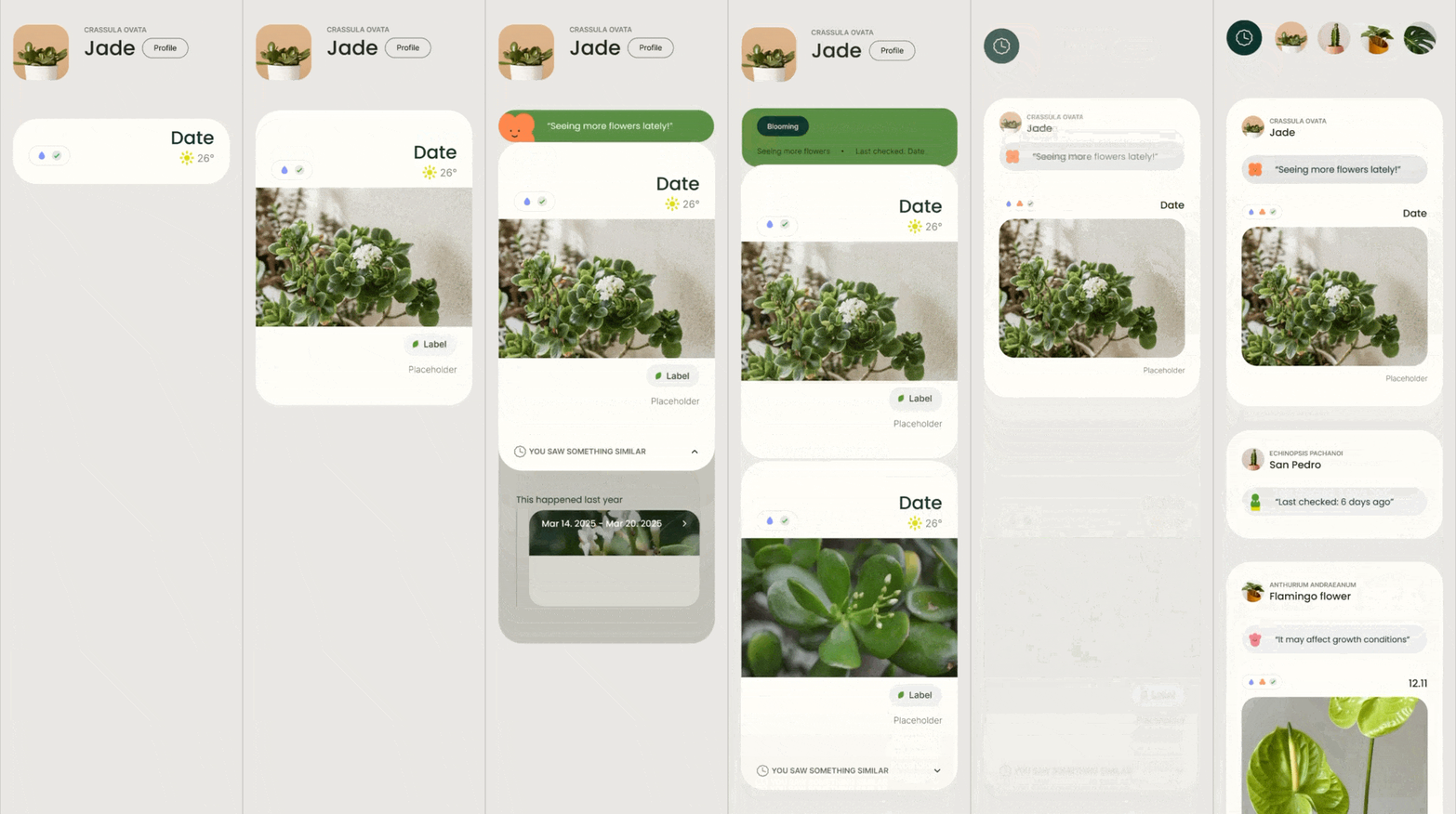

This card system appears throughout the app.
Updating a story, Sharing or asking questions it with the Hub
Hi-fi Prototype
Reflection
This project changed how I think about both product design and plant care.
When we have a relationship with someone, we don’t immediately ask an expert every time something feels wrong. We spend time together, notice changes, and gradually understand each other. That understanding comes from context built over time. I realized plant care is not very different.
Even plants of the same species should not always be cared for in exactly the same way. Since starting this project, I’ve grown four pots of basil. Although they are the same plant, they behave differently. One needs water more often, another grows shorter with a thicker stem, and they respond differently to pruning. The more time I spent observing them, the more I understood their individual needs.
This also changed how I viewed diagnosis. I originally thought diagnosis itself was the problem. Through research and testing, I realized it serves an important purpose: it helps beginners feel less anxious and gives them a starting point. The intention is valuable. The challenge is how certainty is communicated. A diagnosis based on limited context should be presented as one possible explanation rather than a definitive answer. I think it should evolve into something that combines answers with context built over time.
This was my first product design project, and it took time to reach this direction. Along the way, I also became someone who now cares for eight plants. More importantly, the project left me with another question: how could this product continue to evolve?
References