Flexible Planning for Real Life
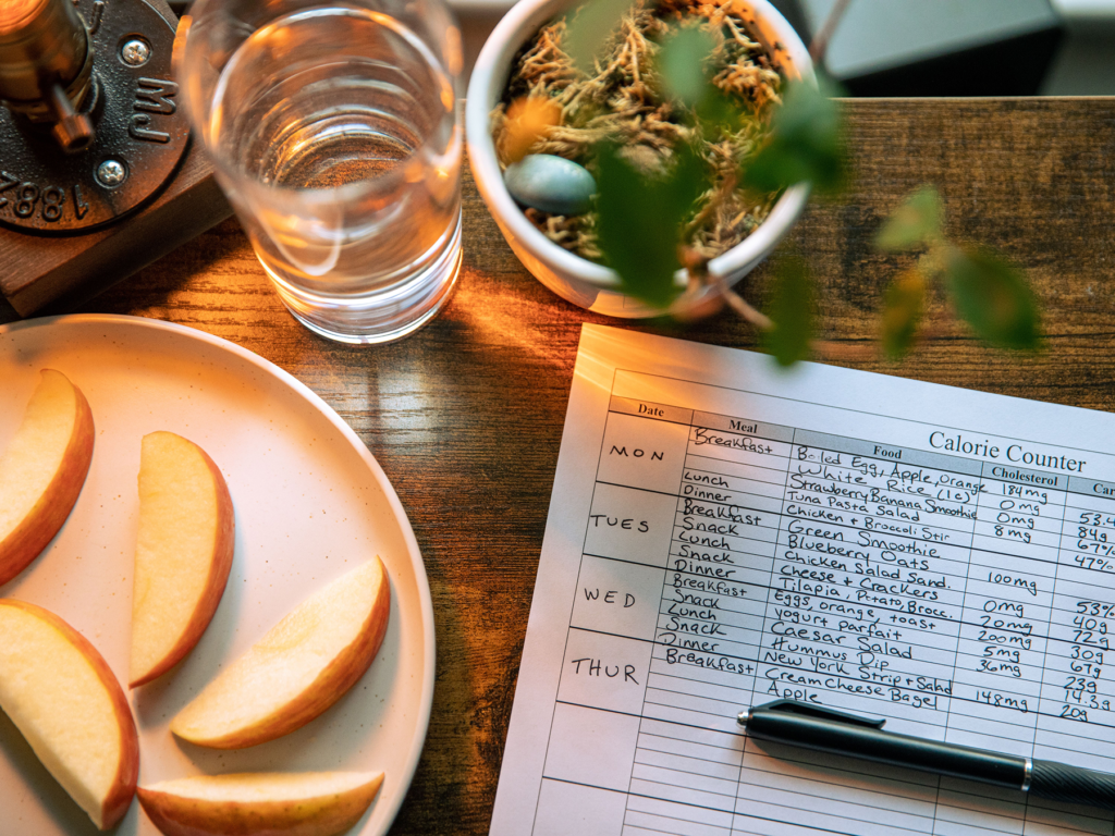
This project was created independently to explore and validate a product concept rather than build a production-ready application.
People who successfully build healthy eating habits are not the ones who never break them. They are the ones who recover quickly. Yet most meal-planning apps are designed around staying on plan rather than helping people recover when life gets in the way.
This project explores how a meal-planning system could helps people adapt to everyday changes and continue building healthier eating habits instead of perfection.
Problem Discovery
Community observation
This project started from a healthy eating community I joined. Although people joined for different reasons like losing weight, managing chronic health conditions, or simply eating healthier — they all shared the same challenge:
Maintaining healthy eating through everyday life.
What “healthy” meant varied from person to person, but their struggle was the same. They found it difficult to stick to their meal plans.
This led me to ask:
Why do people struggle to stick to their meal plans?
Findings from Research
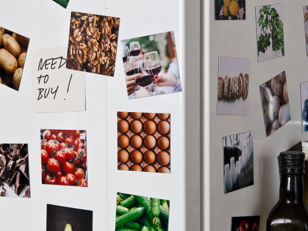
Research revealed three key findings.
1. People slip because of everyday life
Healthy eating is often interrupted by:
- Emotional changes (e.g., stress, low motivation, emotional eating)
- Social situations
- Time constraints
This shows that breaks in healthy eating are a normal part of everyday life.
2. Planning is naturally flexible
People who plan meals are more likely to maintain healthy eating habits, but plans often change in everyday life.
People naturally:
- repeat meals
- skip meals
- move meals
- cook with available ingredients
This suggests that meal planning should accommodate change rather than assume perfect consistency.
3. People help people continue
When motivation drops, people often look to others for encouragement and support.

Existing apps
To understand how current products support these behaviors, I reviewed existing meal planning and tracking apps.
- Success is measured through calories
Many meal tracking products help users monitor their eating through calorie goals. However, success is primarily measured by calorie targets rather than helping users continue their own eating plan. - Planning alone isn’t enough.
Existing products acknowledge practical needs such as meal planning, easier logging, and different measurement systems.
However, users still need flexibility around changing plans, cooking with available ingredients, and using measurements that match how they cook. - Recovery is often overlooked
Many products support users while they stay on plan but offer little support when they slip. Missing logs or going off plan can feel like failure, making it harder for users to get back on track.
These findings suggest that:
- slipping is unavoidable
- existing systems often frame slipping as failure
- behavior is naturally non-linear
- recovery can be socially supported
That means meal planning shouldn’t expect people to follow a perfect plan. It should be flexible enough to handle setbacks, support recovery, and make healthy eating easier to maintain over time.
People who successfully build habits are not the ones who never break them. They are the ones who recover quickly.
Product Principles
Based on these findings, the product should:
- Treat slipping as part of the process
Help users recover and continue instead of resetting progress. - Support flexible planning
Allow users to easily create, edit, move, and repeat meals, with recommendations and recipes that adapt to their behavior over time. - Use Join-ins as social motivation
Provide lightweight encouragement through shared goals and participation.
The goal is to create a meal-planning experience that emphasizes continuity, flexibility, and recovery, helping users maintain healthier eating habits without requiring perfect adherence.
Product System
Core
- Flexible planning keeps users moving forward without pressure.
- Meal recommendations and community help users re-enter after slipping.
Flexibility is the foundation. Past behavior and community become the triggers for getting back on track.
Flexible planning
It supports:
- Multiple date selection
- Person-based serving customization
- Reusing previous meals by moving them into a new plan instead of recreating them
- Helping users plan around what ingredients they probably have and what they still need to buy.
Recovery Triggers
People often fall off track because of emotions or changing life circumstances. Rather than fighting emotion, the system uses it as a recovery trigger by resurfacing meals that previously made users feel good, stay motivated, or successfully return to their routine.
The system observes:
- Planned, completed, and adjusted meals
- Post-meal reviews
- Pantry habits
- Recurring meal patterns
It adapts:
- Meal recommendations
- Pantry suggestions
- Recovery recommendations
- Community
Recommendations become more reliable by prioritizing:
- What users did over what they planned
- Recent behavior over older behavior
- Repeated behavior over one-time behavior
As confidence grows, recommendations rely more on consistent behavioral patterns than isolated actions.
Testing
Meal planning
Planning meals is the core experience of the product, so I focused on making the first step into planning as effortless as possible.
During my research, I noticed that many people planned meals using calendars attached to their refrigerators. Because meal planning naturally revolves around days and weeks, I wanted the interface to reflect that behavior by making the calendar a central part of the experience.
1. Users will quickly understand how to plan meals without hesitation or confusion by tapping the Add(+) button.
My first approach was to place the Add(+) button prominently across the daily, weekly, and monthly calendar views without distracting from the planning experience. I expected tapping the Add(+) button to be the primary way users would start creating a meal plan.
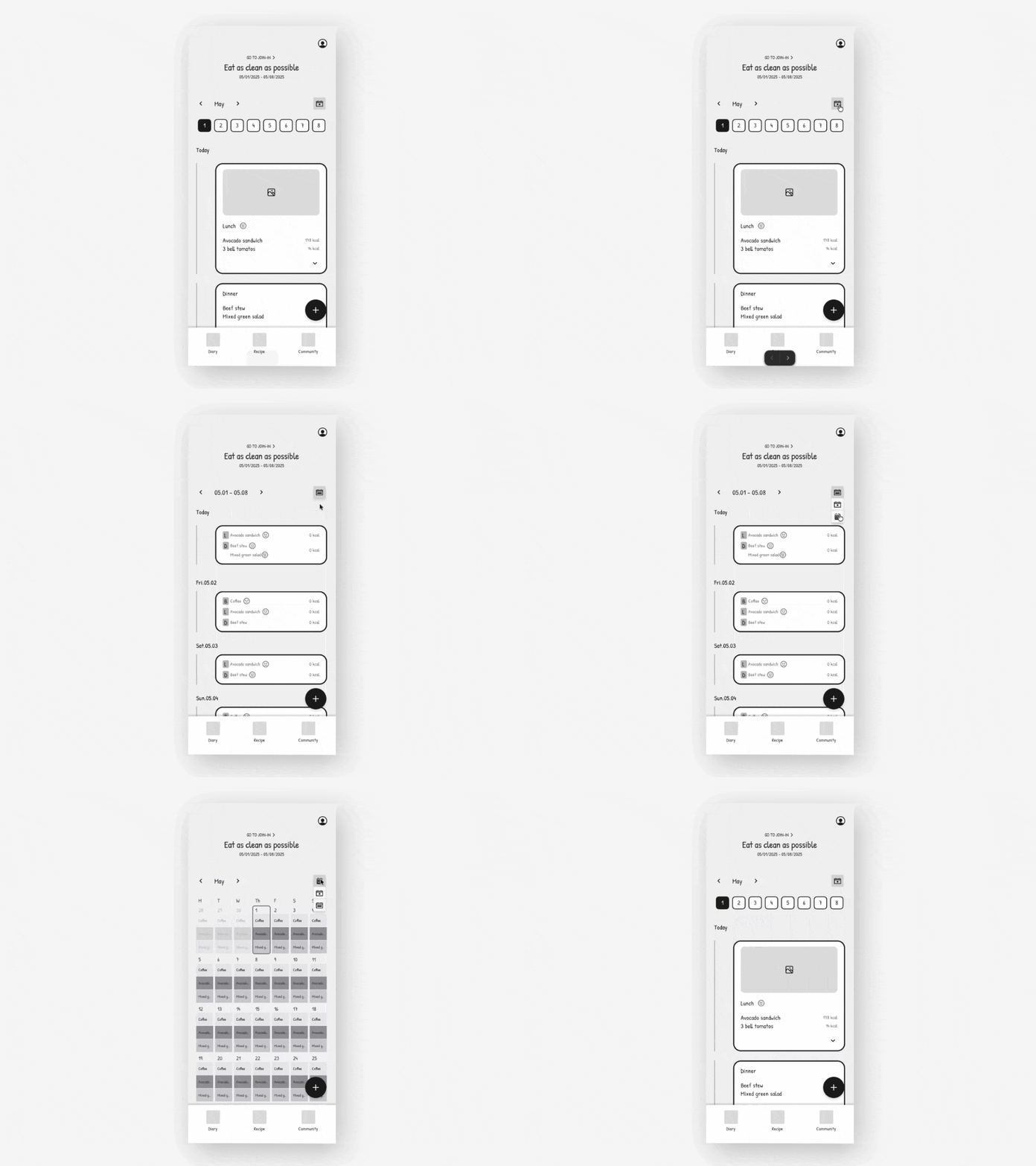
However, usability testing revealed something different. Instead of consistently tapping the Add(+) button, participants split into three paths:
- the Add(+) button
- a date on the calendar
- the Recipes tab to browse meals first
Initially, I assumed the Add(+) button wasn’t prominent enough. During the interviews after testing, however, I realized that the issue wasn’t visibility. It was that participants approached meal planning with different mental models.
Because some people already know what they wanted to eat and started by creating a plan. Others prefer to choose a date first before deciding on a meal, while some wants to browse recipes before making a decision.
Rather than forcing everyone into a single workflow, I redesigned the home screen to support these three entry points. The calendar views were previously the main focus, so I reduced their visual emphasis and gave more space to the other entry points.
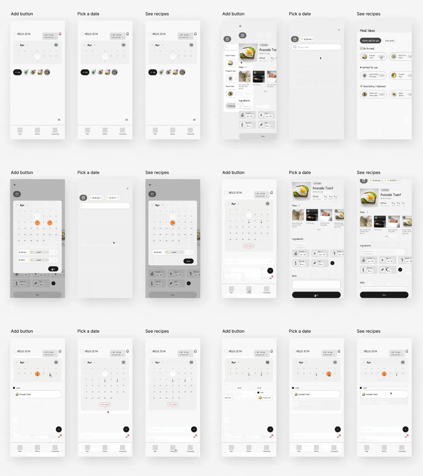
2. Users expect meal plans to be easy to change.
Because plans often change due to everyday circumstances, editing a meal plan is one of the product’s most important flows.
I separated interactions into two levels:
- Simple planning actions happen directly on the calendar.
- Meal edits happen inside the meal plan.
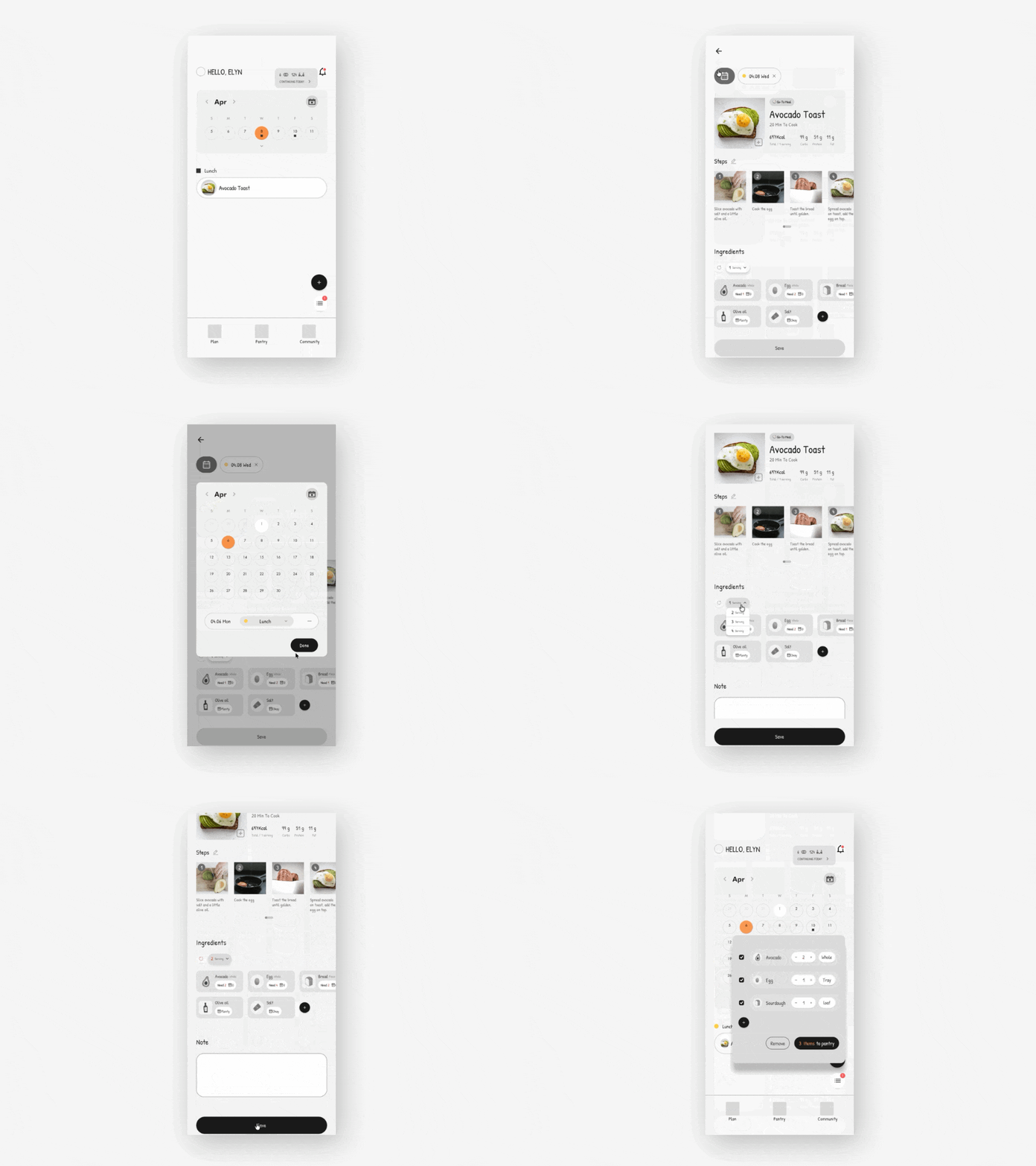
For simple planning, since many people already plan and change their meals using calendars in real life, I wanted the experience to reflect that familiar way. So users could simply move or reuse a planned meal directly from the calendar.
If they need to modify the meal itself, they can open the meal plan and edit its details. Opening a meal should only be necessary when editing information such as servings, ingredients, or notes.
The goal was to know whether users understood that quick changes could happen directly from the calendar, while more detailed edits required opening the meal plan.
Detailed edits
Simple edits
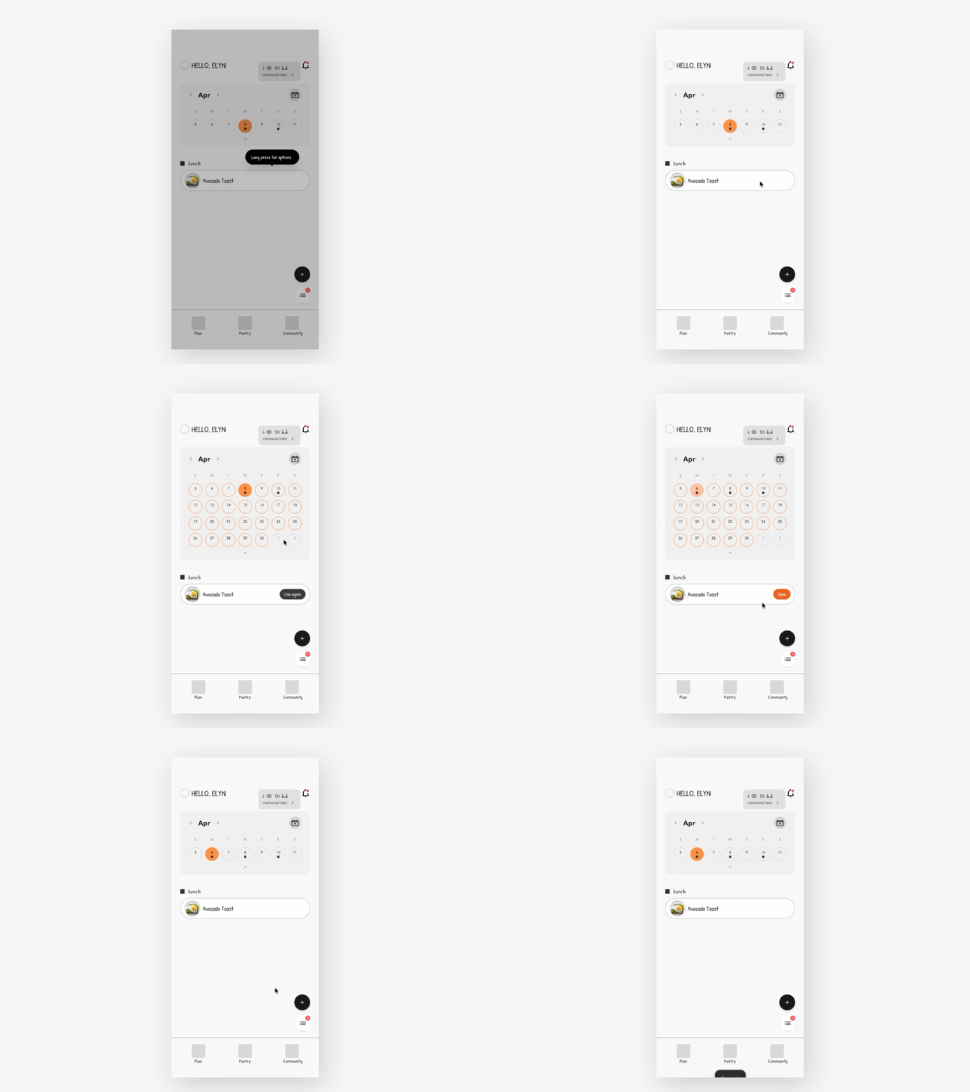
Participants moved through the flow without hesitation. However, the long-press interaction for simple edits relied on a visible hint for discoverability. Exploring more intuitive ways to surface this action would be a valuable future iteration.
Pantry
The pantry is designed to represent the ingredients users typically have, rather than maintaining a perfectly accurate inventory. This allows the system to recommend recipes that are more relevant to each user’s cooking habits.
1. Testing how users respond to likely available ingredients
Although we can’t confirm whether seeing available ingredients actually makes meal planning easier yet, that would require longer-term testing. For now, I wanted to see how participants responded to having this information alongside the planning process.
In the earlier testing, participants were asked to plan meals while viewing the ingredients already available in their pantry alongside the ingredients they still needed to buy.
Participants said they found this useful and responded positively to the Recipes from your staples section on the pantry page. This suggests that showing recipes based on ingredients users typically have could support their planning process.
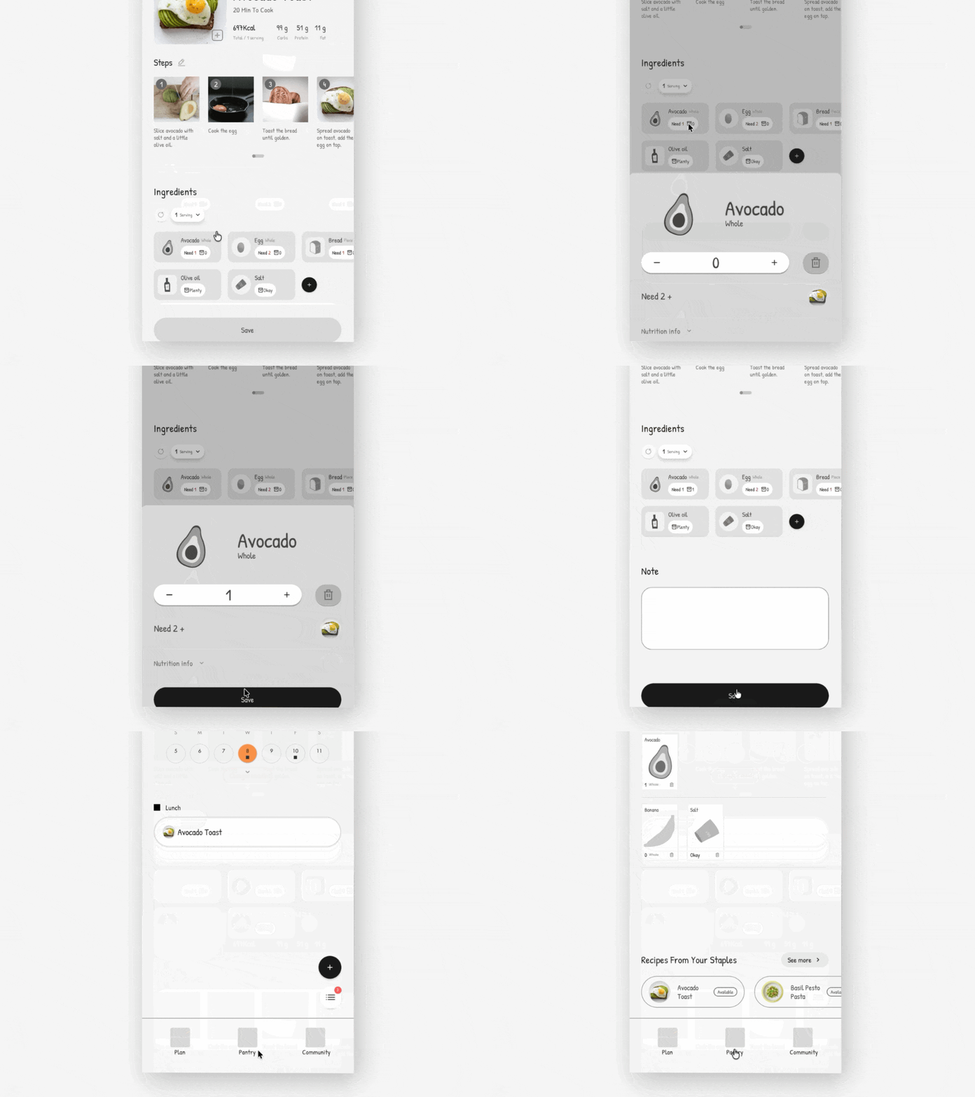
2.Users can easily update their pantry after shopping.
Participants were given a scenario where they had bought additional ingredients beyond the suggested list and were asked to update their pantry. All participants were able to make the changes without difficulty, supporting the idea that the pantry can flex with what users actually buy.
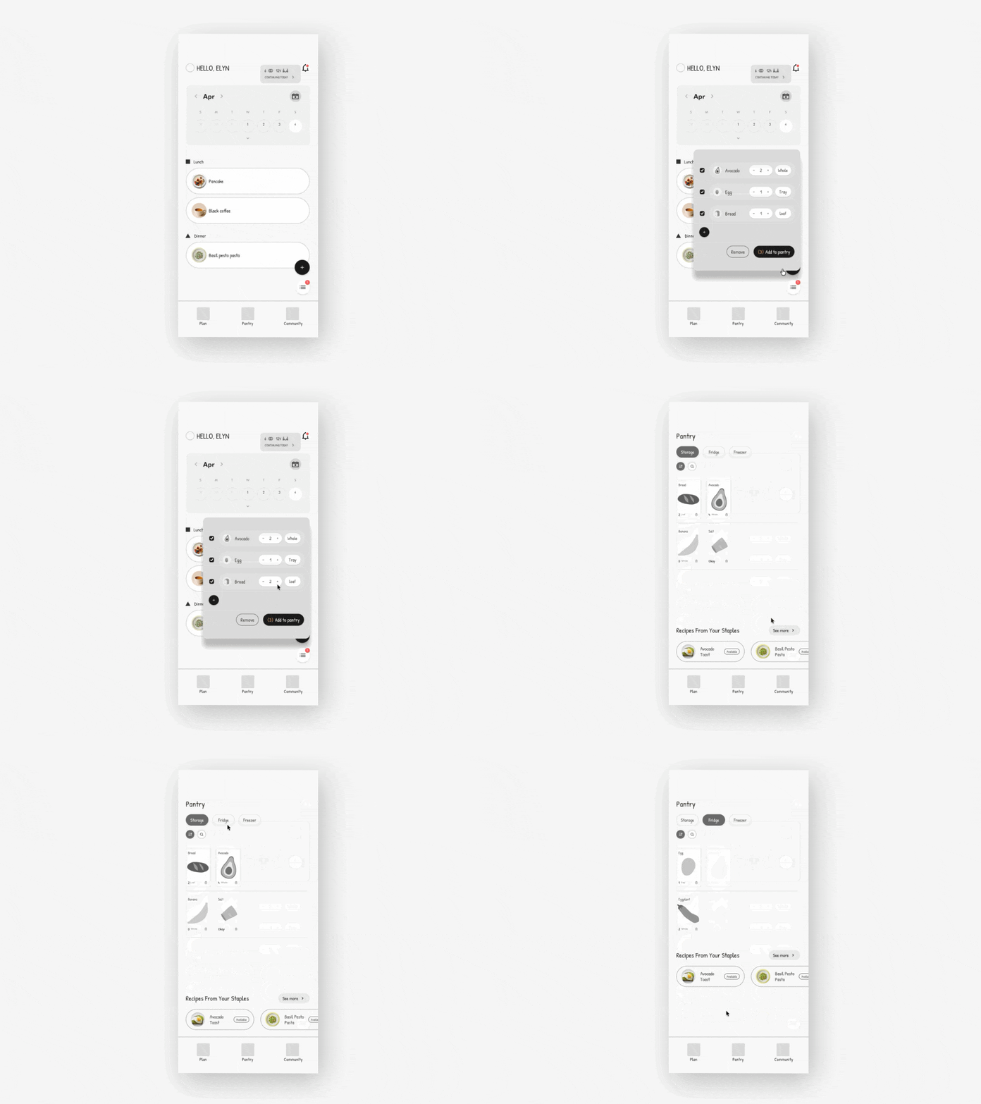
Future validation
The pantry is not designed as an exact inventory system. It connects meal planning and shopping by showing what users likely have and what they need to buy, creating a seamless flow from choosing a meal to preparing the ingredients.
Over time, the product could explore whether more relevant recipe recommendations encourage users to keep their pantry updated as they see more value from the feature. This long-term behavior would require validation through an MVP and continued usage over time.
Join-in (community)
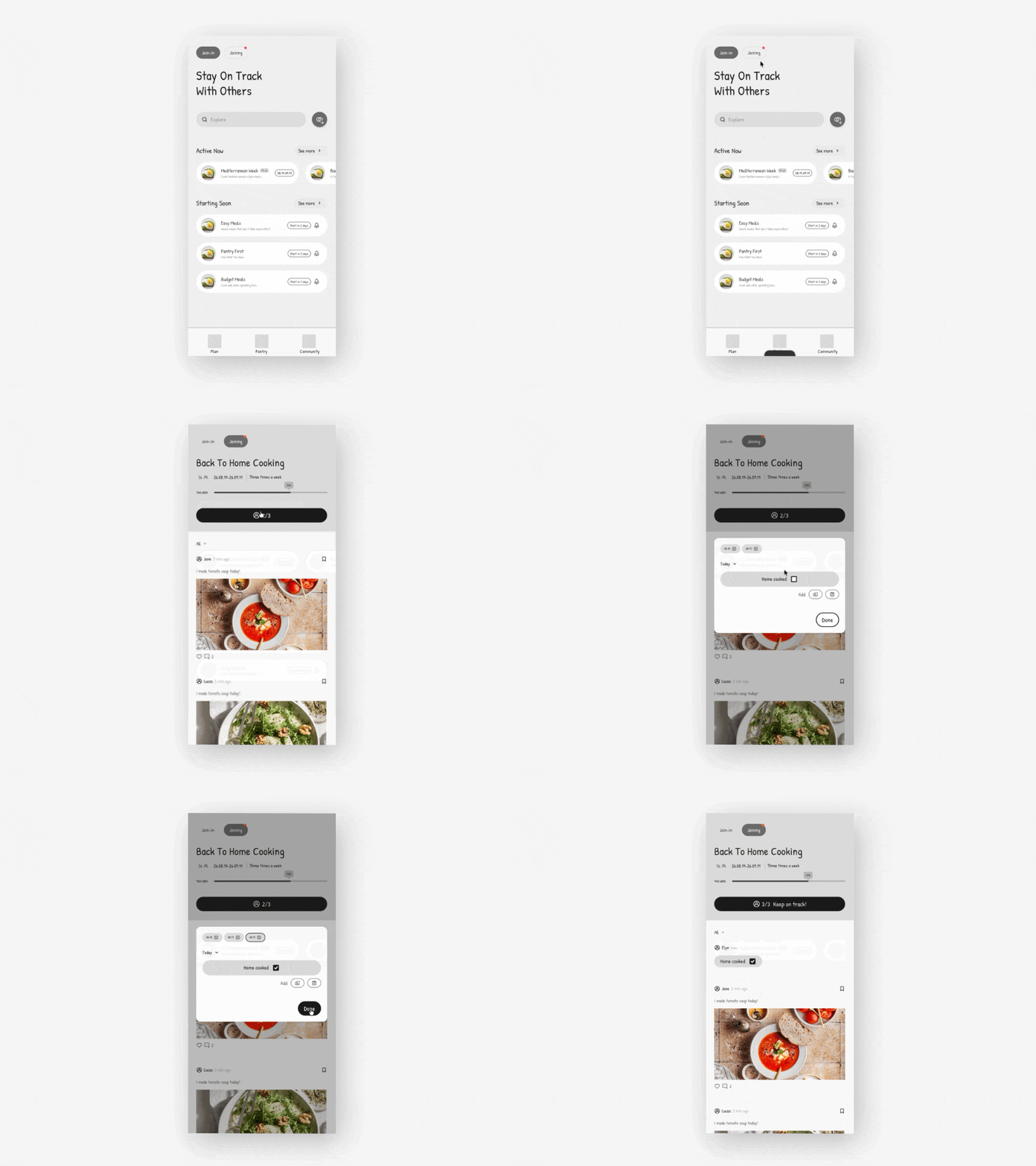
Since Join-ins are designed for people to participate in activities together toward a shared goal, I tested whether users understood its purpose.
Initially, I had combined checking in and writing a post into the same flow. But when participants asked about posting, I realized that sharing was a distinct path on its own, rather than something that was part of the check-in flow. So, in the next iteration, I gave sharing its own space and separated the two paths.
Design decision
Cooking as Art
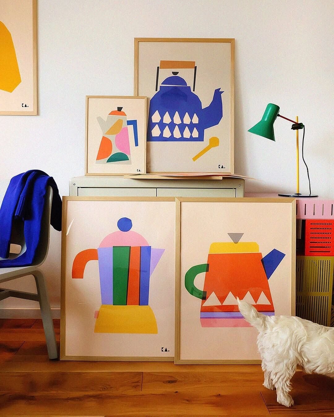
During usability testing, I used illustrated ingredients mainly because they matched the handwritten typography (Patrick Hand) in the prototype. Although I did not intend to evaluate the illustrations, three out of five participants mentioned that they liked seeing illustrations in the product. This suggested that illustration could bring a lighter and more approachable feeling to the product.
However, I did not want the experience to feel overly playful, as the product supports people who are building healthier eating habits and still needs to feel calm and intentional. To balance the warmth of illustration with a more thoughtful tone, I explored a museum and gallery-inspired visual direction.
This led to the concept of Cooking as Art.
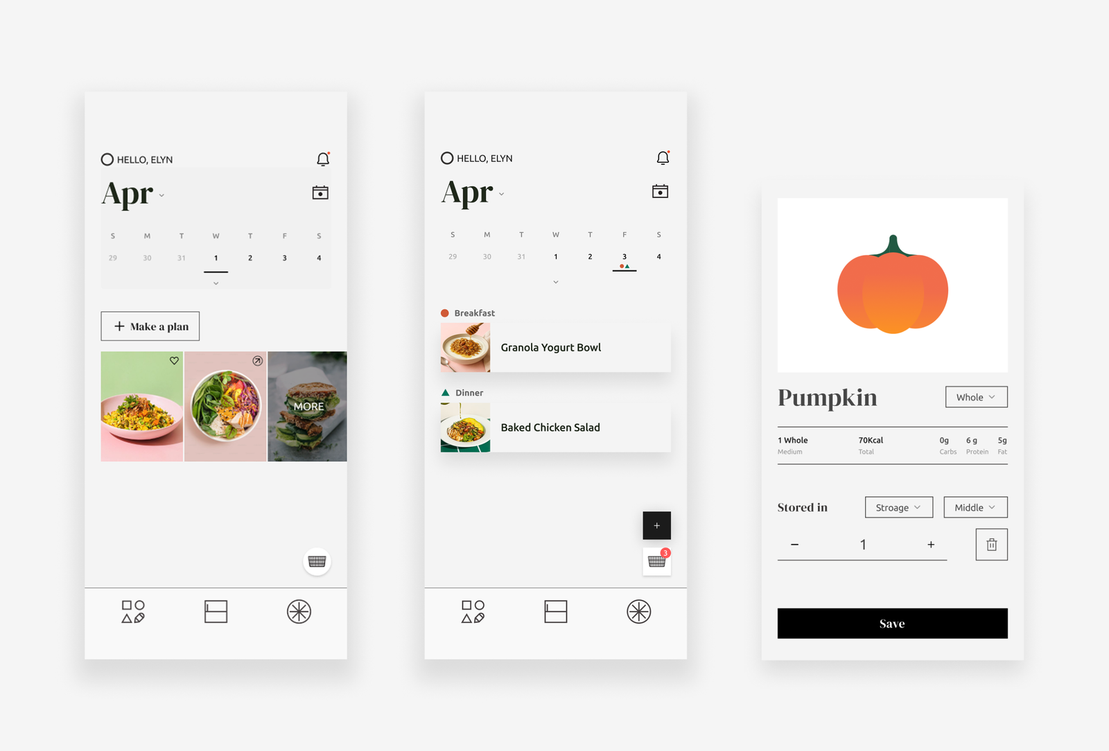
To me, cooking is much like making art. It is a creative activity that does not have to be perfect every time. If one meal does not go as planned, users can simply return and create again. I wanted healthy eating to feel the same way.
To express this idea, I used generous whitespace, thin lines, and a restrained color palette inspired by editorial and gallery layouts. DM Serif Display adds a museum-like tone, while soft, diffused shadows create the feeling of artworks displayed on a gallery wall.
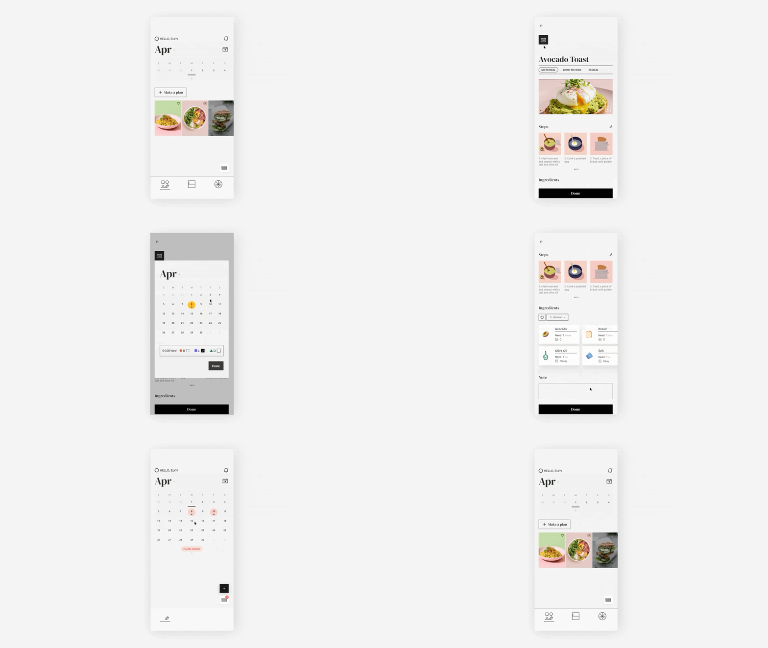
Main home
Recommendations
I then focused on how the home screen could help users get back into planning. One part of that was recommendations. Recommendations are organized into three categories:
- Go-to Meals — meals users frequently choose.
- Enjoyed Meals — meals users reviewed positively.
- Back-on-Track Meals — meals that previously helped users return after slipping.
These recommendations remind users of what has worked for them before.
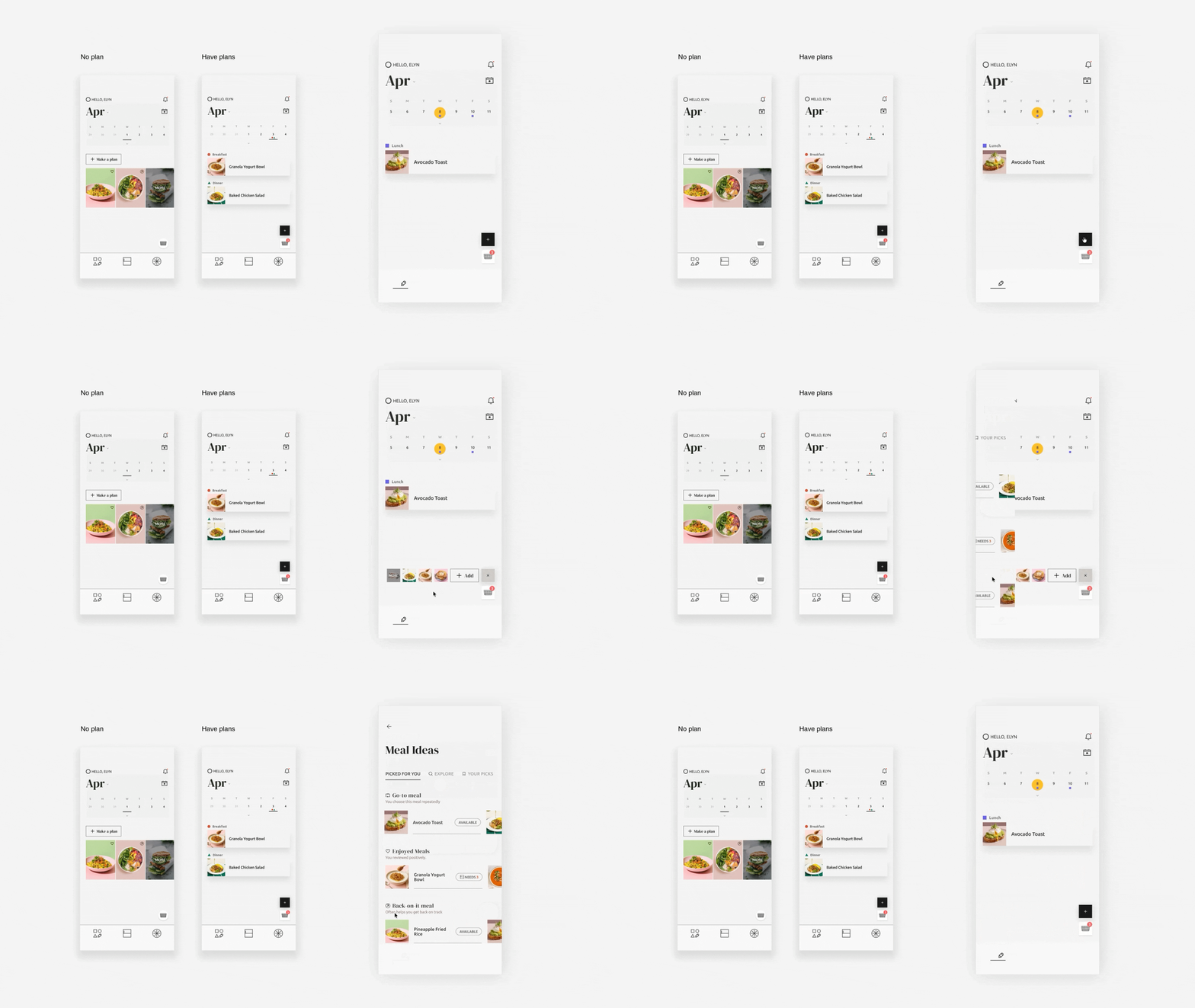
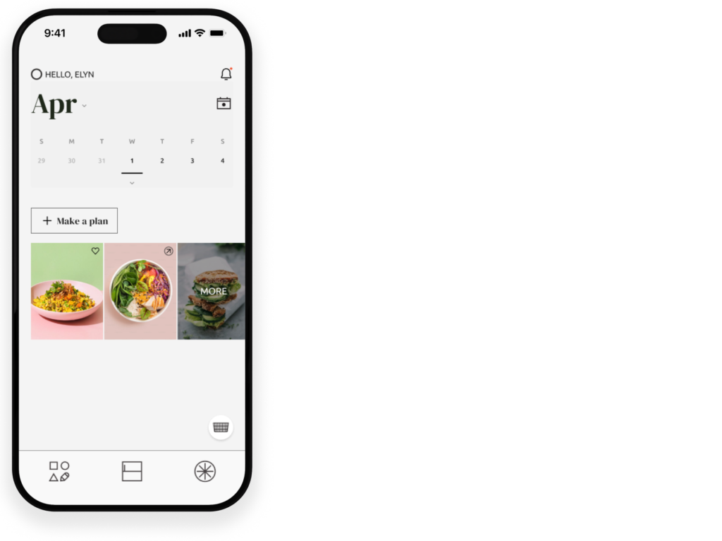
When no meals are planned, recommendation cards are placed at the center of the planning screen to encourage users to start planning. Once meals are added, they move below the calendar, just above the shopping cart, so they remain accessible without competing with the meal plan.
Progress
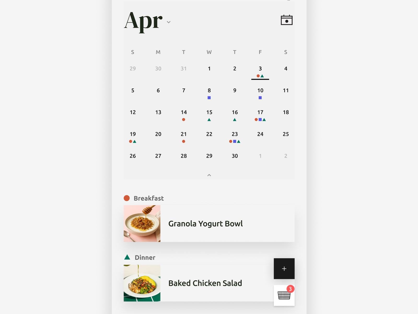
Instead of using progress bars or numerical streaks, progress is reflected through the meal plan itself. Planned meals are displayed on the calendar with meal-time indicators, allowing users to see how they’ve planned their meals over time without emphasizing perfect consistency.
Review meals
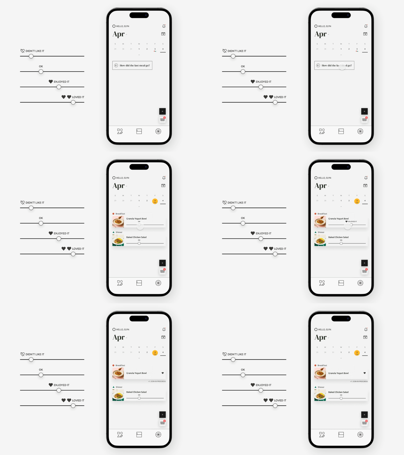
After each meal, users are prompted with a simple review. They update how the meal felt by adjusting a slider, with “OK” as the default position.
I chose a slider because the dragging interaction feels fluid and reflects the product’s philosophy of flexibility.
Pantry
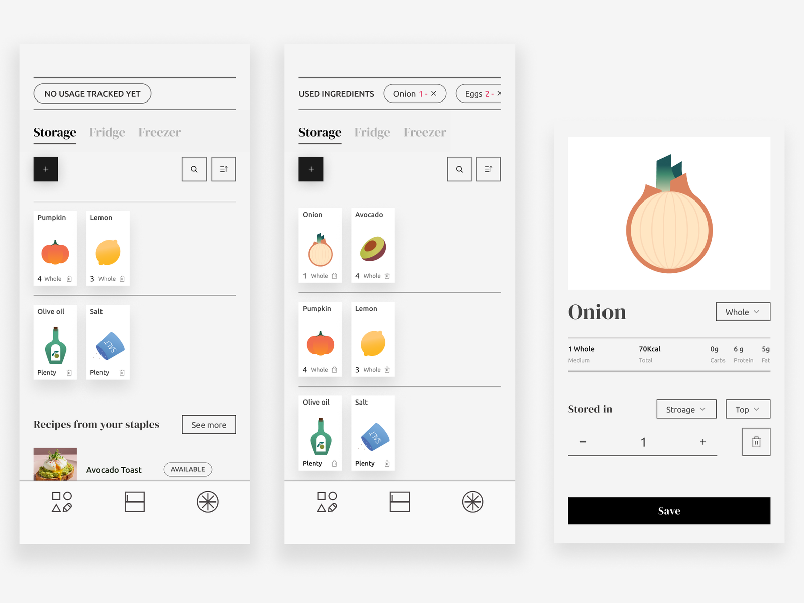
The pantry works differently depending on whether there’s any usage history. Before users have used any ingredients, the top section shows that there’s no usage history yet. Once they start using ingredients, that section changes to surface the ones they’ve recently used, so they’re easier to check and update.
To reflect how people naturally organize their kitchens, pantry locations are divided into their own sections. Users can assign a level from the ingredient detail page, making the pantry feel more familiar and personalized.
Join-in
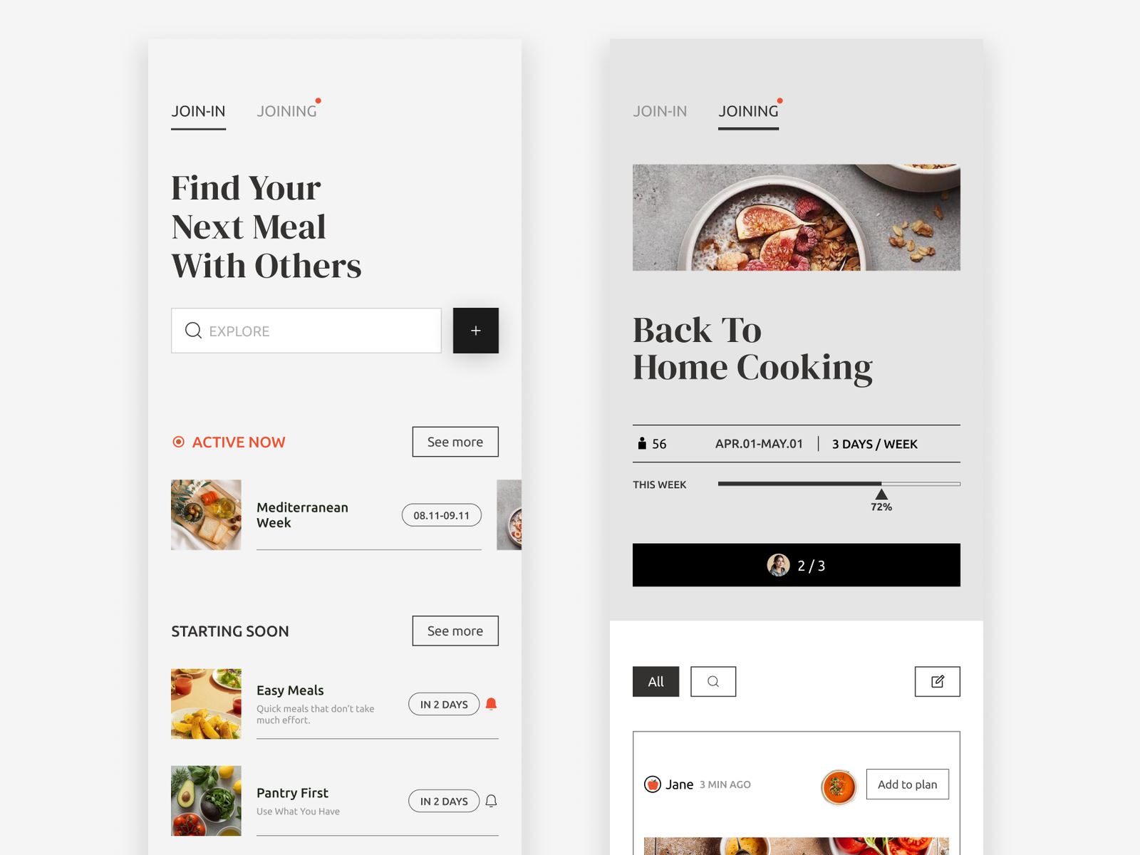
Based on the earlier feedback, I separated the posting section from the checking-in flow. Each ‘Joining’ page includes a progress bar so users can see the group’s overall participation and feel motivated by working toward a shared goal together.
The Join-in page shows activities that are currently active as well as those starting soon. Users can tap the bell to get a notification when an upcoming activity begins, making it easier to keep track of what’s happening even when they’re away.
Hi-fi Prototype
Takeaways
This project showed me that designing for behavior is less about creating a single “correct” flow and more about understanding how people naturally approach and adapt to a task. While research helped define the direction, usability testing revealed the differences in how users actually think and interact with the same system. It reinforced the importance of designing flexible systems that can support different mental models rather than forcing a single way of doing things.
Looking at the project as a whole, I started to think differently about what it means to design for behavior. Building a habit isn’t a linear process. People fall out of routines, change their minds, and sometimes just stop for a while. But being able to come back still matters.
That made me think that maybe the goal isn’t always to make people more consistent. Sometimes, it’s about making it easier to return when they’re not. I believe designing for recovery is more meaningful than designing for perfect consistency, although whether this approach actually helps people return would still need to be validated through further testing.
We can’t always control our own behavior, but we can control some of the structures around us, and those structures can either make returning easier or make it feel even harder.
I realized this personally because I often beat myself up when I don’t do what I promised myself I would do consistently. This project made me think more about how much the things around us can either support that behavior or work against it. And I think that’s something good design can actually influence.