Problem
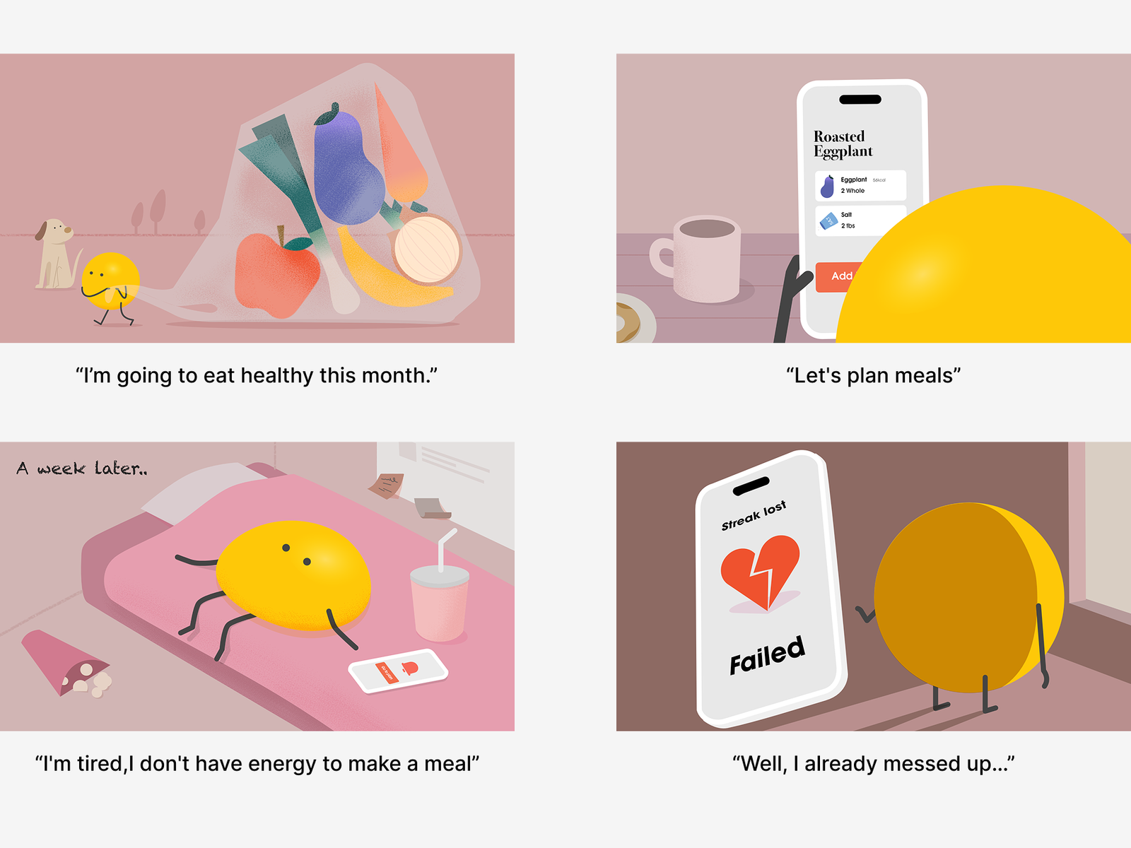
Meal planning apps are designed for sticking to a plan and tracking calories.
In reality, healthy eating is interrupted by: changing schedules, emotional changes, social situations. When users go off-plan, many systems make it feel like they have failed, making it harder to return.
Insight
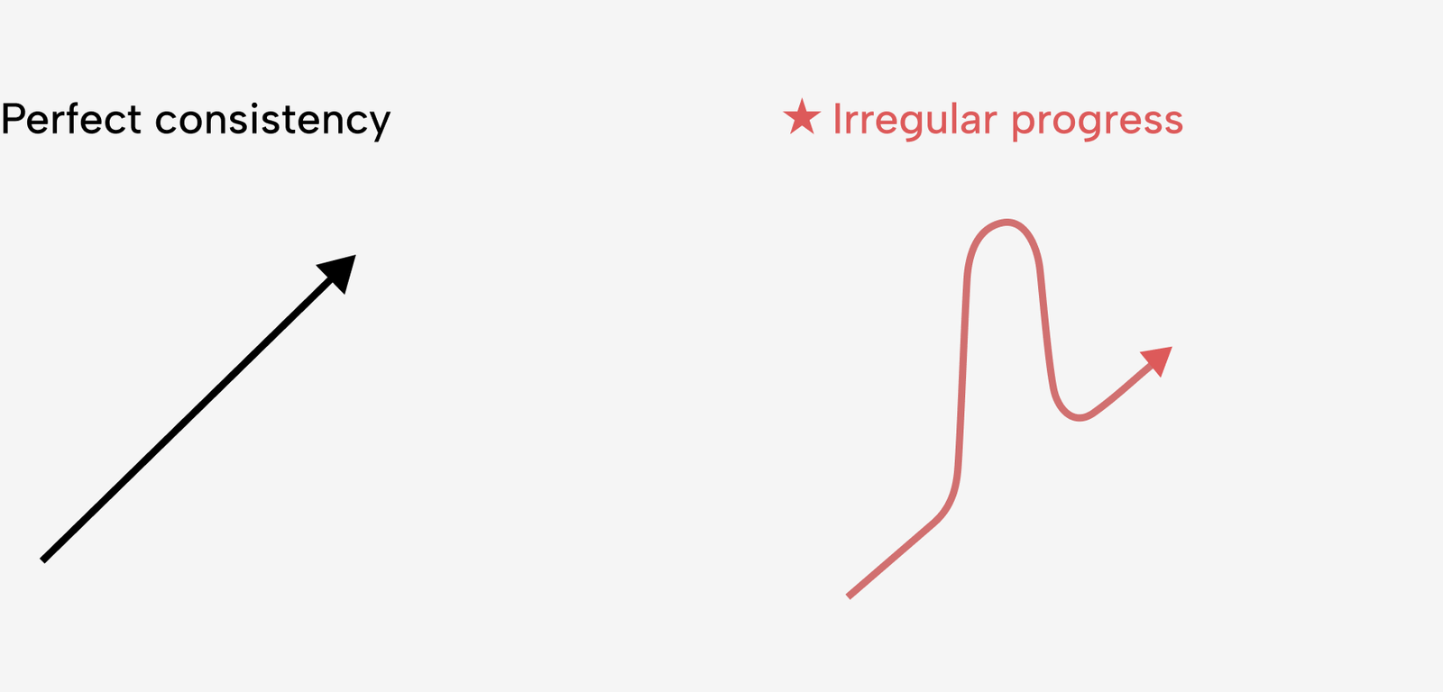
Since going off-plan is inevitable, it should be treated as part of the journey rather than a failure. People who succeed are not the ones who never slip, but the ones who recover quickly and return to their routine.
Direction
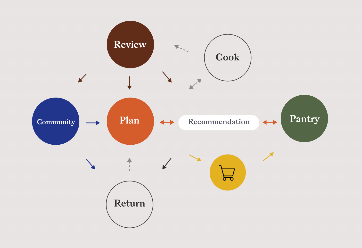
I shifted meal planning from maintaining a perfect routine to supporting continuous progress.
The system supports flexibility and recovery by helping users adapt plans and reconnect with previous experiences.
Flexibility
- Choose multiple dates, adjust servings, reuse past meals
- Plan around what you likely have
Recovery triggers
- Post-meal reviews
- Pantry habits
It adapts
- Meal recommendations
- Pantry suggestions
- Community
Test
From a single entry point to different ways in.
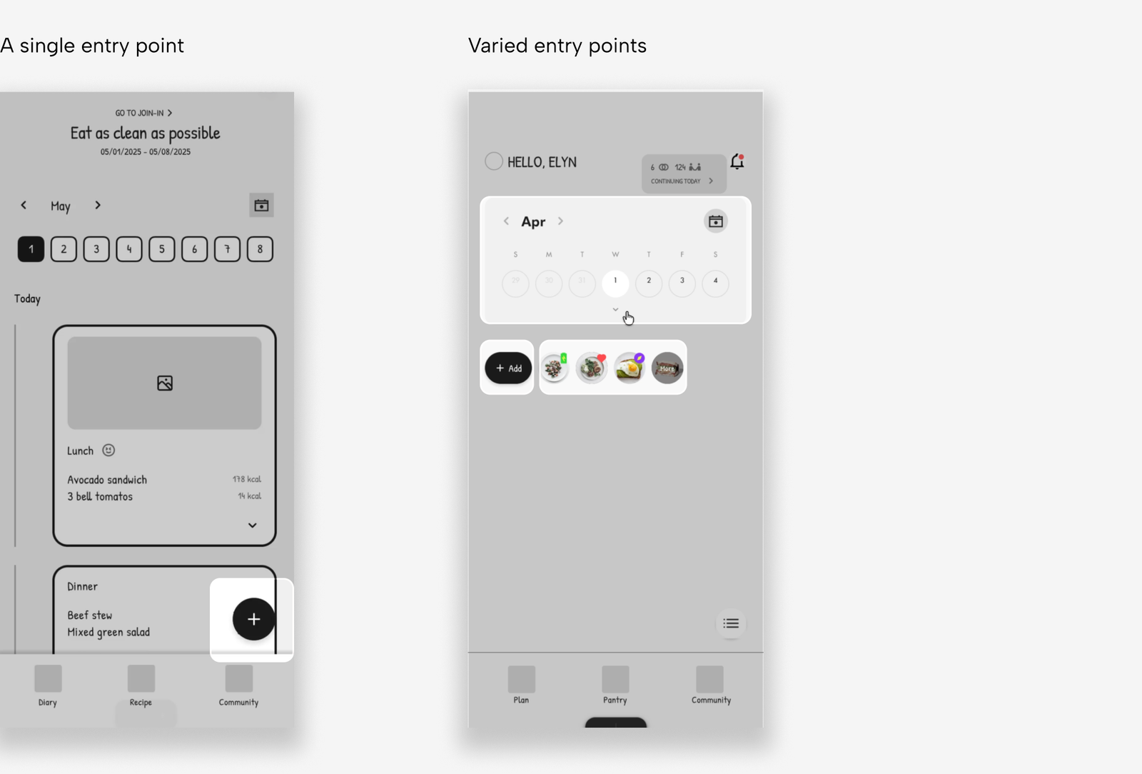
I initially thought users would start meal planning through the prominent + button. But testing showed that people had different intentions. Some wanted to add a meal, some started with a date and others wanted to browse recipes first. So instead of pushing everyone toward one entry point, I designed the home screen around three different starting points.
Quick edits, detailed when needed
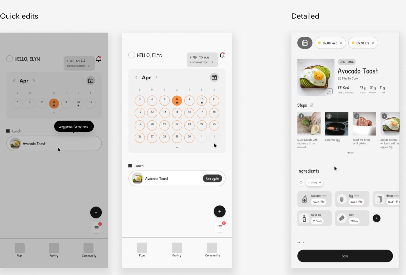
Plans change all the time, I saw editing as an important part of the experience. But not every change needs the same level of effort. Sometimes users just need a quick adjustment while other times they need to edit the meal itself. So I designed two ways to edit: quick changes directly from the calendar, and detailed edits when they need to change the meal.
Iteration
Once the core flexible flow was working well, I focused on extending that flexibility to other parts of the experience.
Recommendations
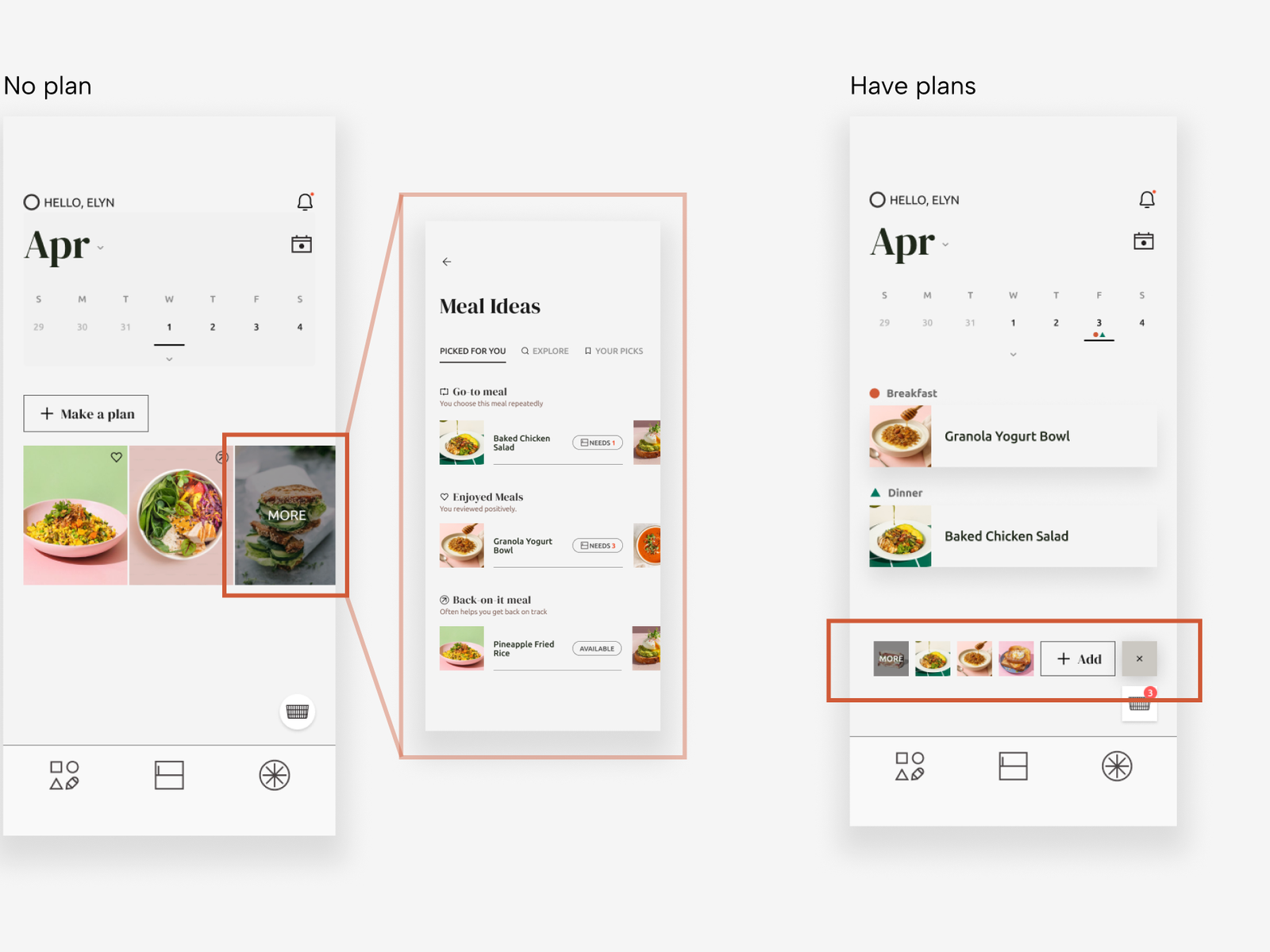
I worked on how recipe recommendations could help users get back into planning. I grouped them based on what they’ve shared about their own experiences: Go-to, Enjoyed, and Back-on-Track Meals. When nothing is planned, they appear in the center to help users get started. Once a plan is added, they move below the calendar to stay accessible without competing with it.
Progress
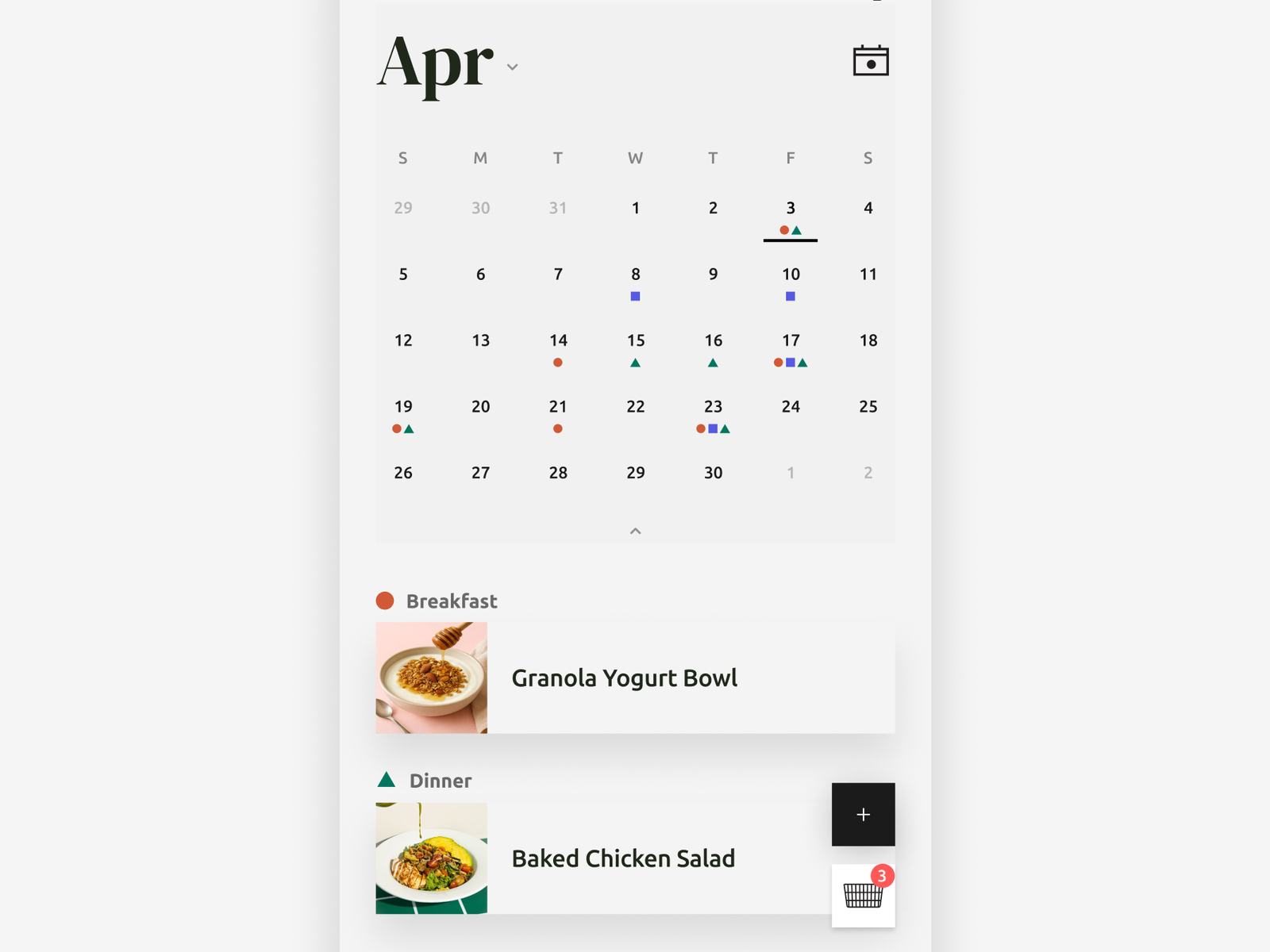
Once users start planning, their activity naturally builds up on the calendar. Instead of using scores or streaks, I wanted progress to come from the planning itself.
Ingredients usage
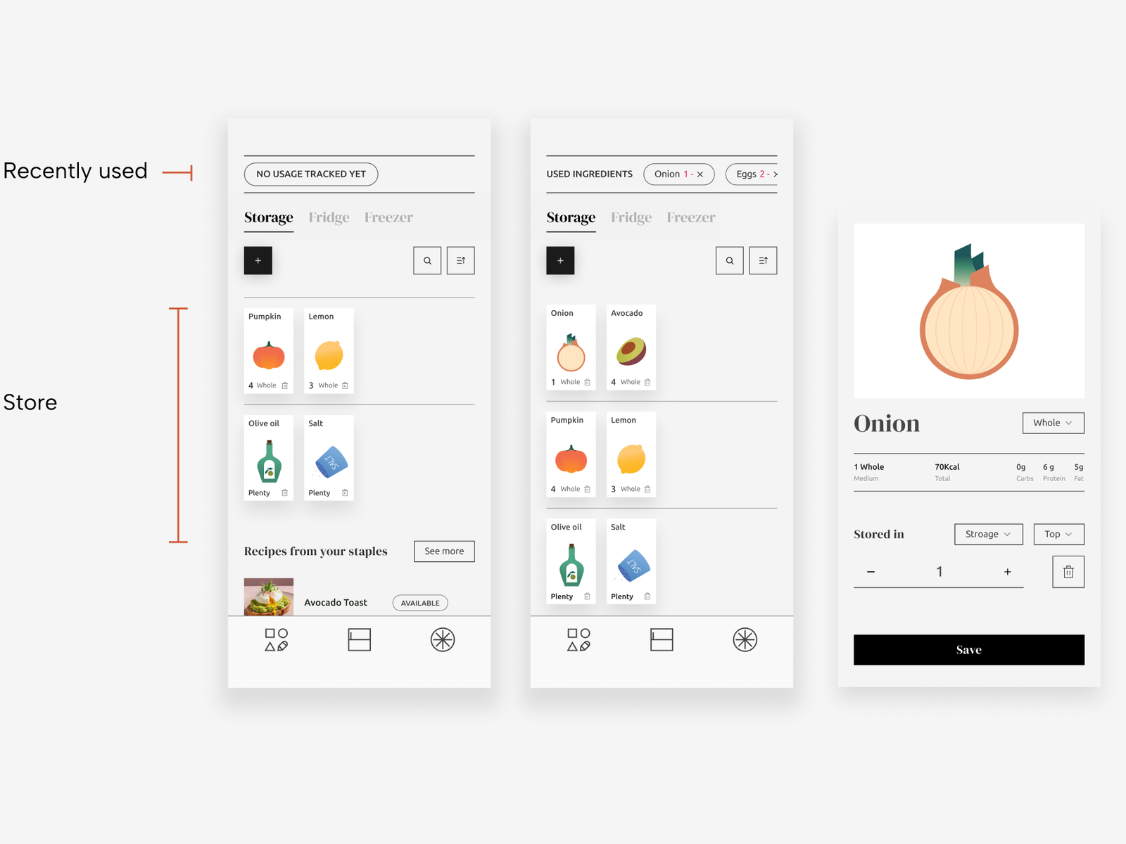
I designed the pantry to surface recently used ingredients, making it easier for users to check and update what they have. Users can also organize ingredients into their own sections, making the pantry feel more familiar and personal.