Problem
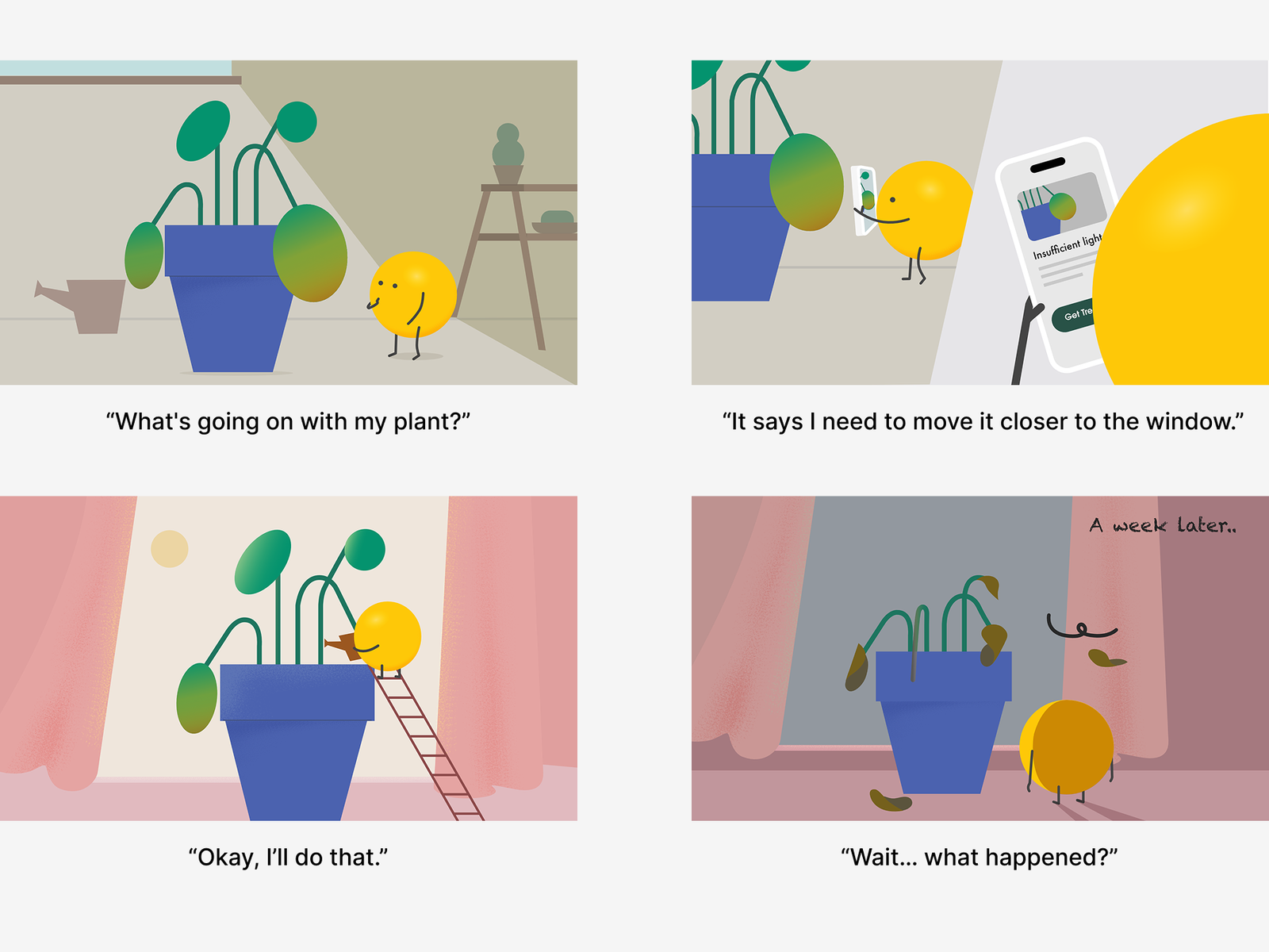
Plant care apps try to reduce uncertainty through diagnosis, but plant health cannot be understood from a single moment.
A photo captures only a snapshot and misses important context like past changes, environment, and care history.
As a result, users often receive uncertain answers presented with more confidence than the available information supports.
Insight
Plant care is not about finding a single correct answer.
Understanding comes from observing changes, building history, and recognizing patterns over time.
Experienced plant owners build confidence not through diagnosis alone, but through continuous observation.
Direction
I designed a plant care system centered around observation rather than diagnosis.
The product helps users build context by connecting current states with past moments, care actions, and shared knowledge.
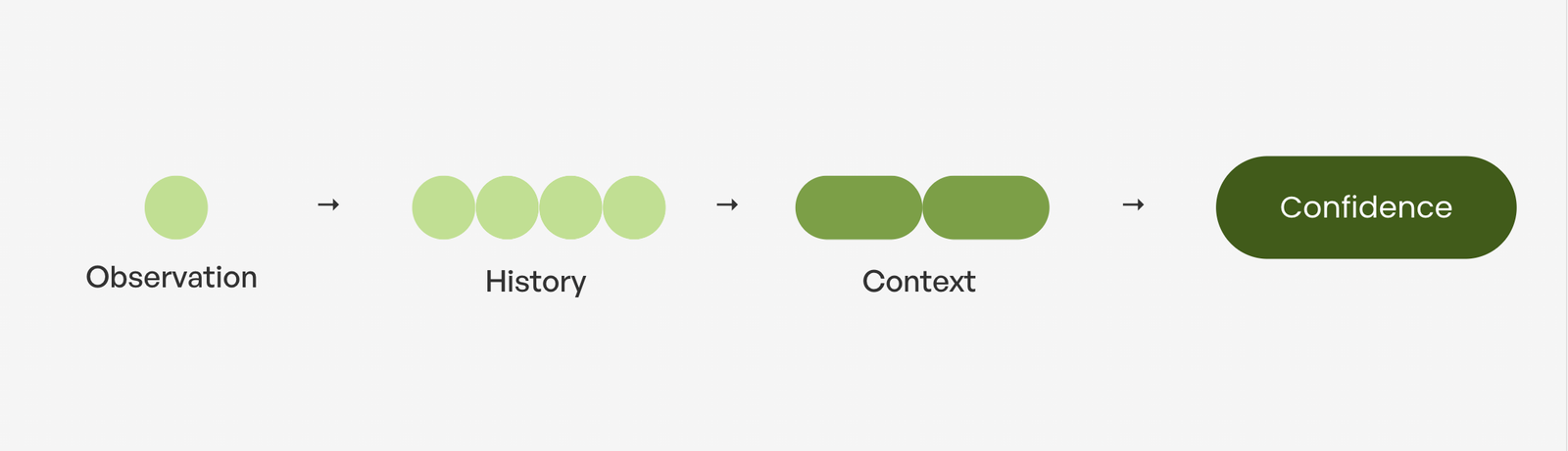
Over time, observation becomes history, history creates context, and context builds confidence.
Test
Do users find value in observation?
I first tested diagnosis and observation using the same yellowing-leaf scenario. Participants felt more like they were spending time with plants for the observation, but still preferred diagnosis because the situation felt urgent.
This changed my thinking: diagnosis and observation serve different situations.
So I retested them with two scenarios:
- Yellowing leaf → Diagnosis
- Blooming → Observation
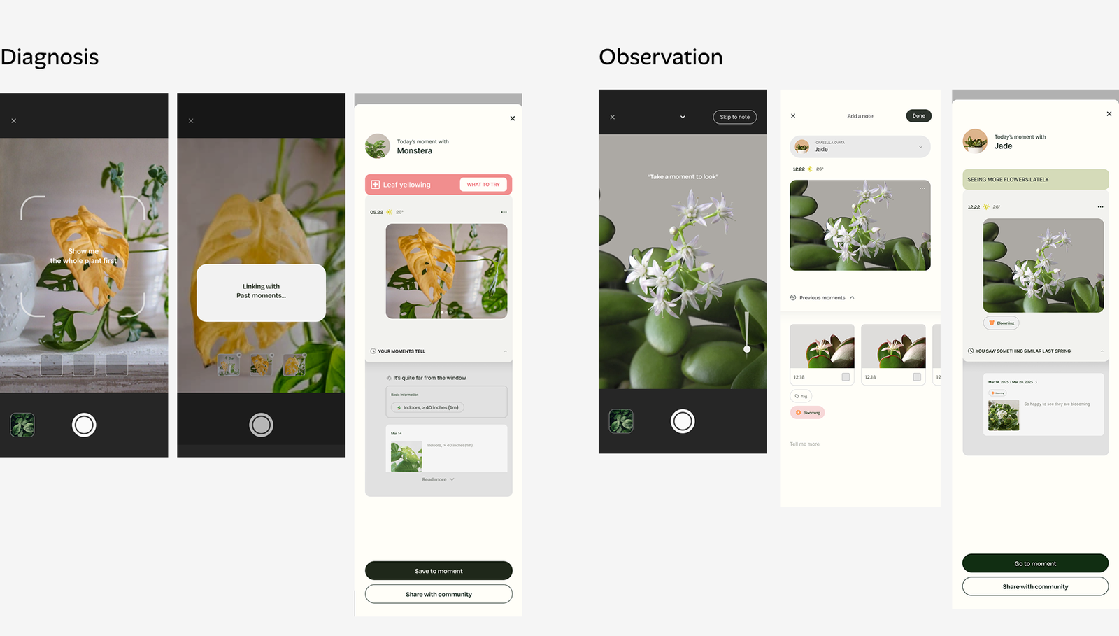
This time, participants clearly understood when each flow was useful and found previous moments meaningful for understanding change over time.
Can comparing Images help users understand plant changes?
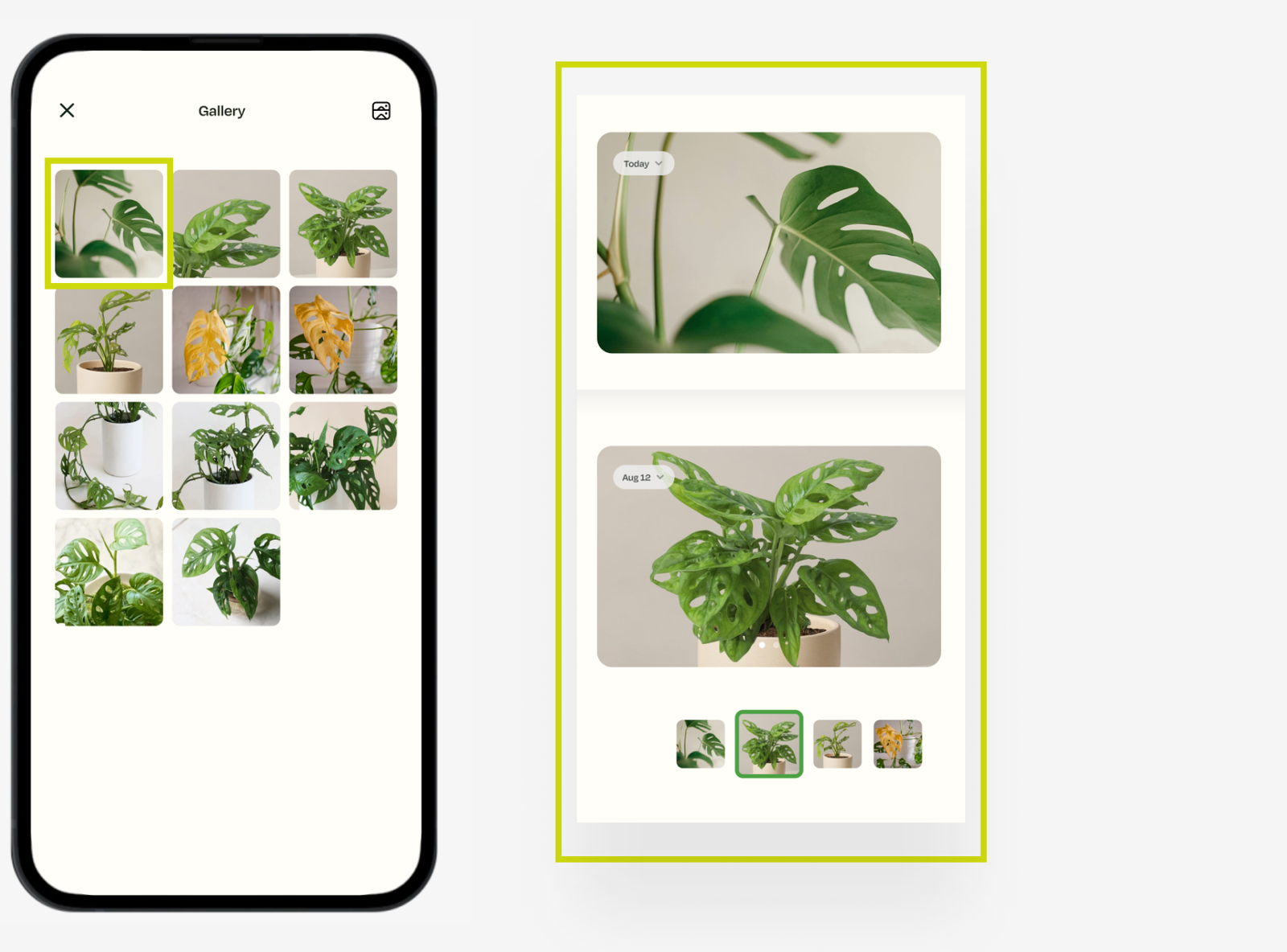
I also tested whether the comparison gallery could help users understand their plant’s history. The current moment appears at the top, while previous moments are organized below, making it easier to compare changes over time. Participants were able to understand how plants had changed, which validated the comparison gallery.
Would users value enough phase-based timelines?
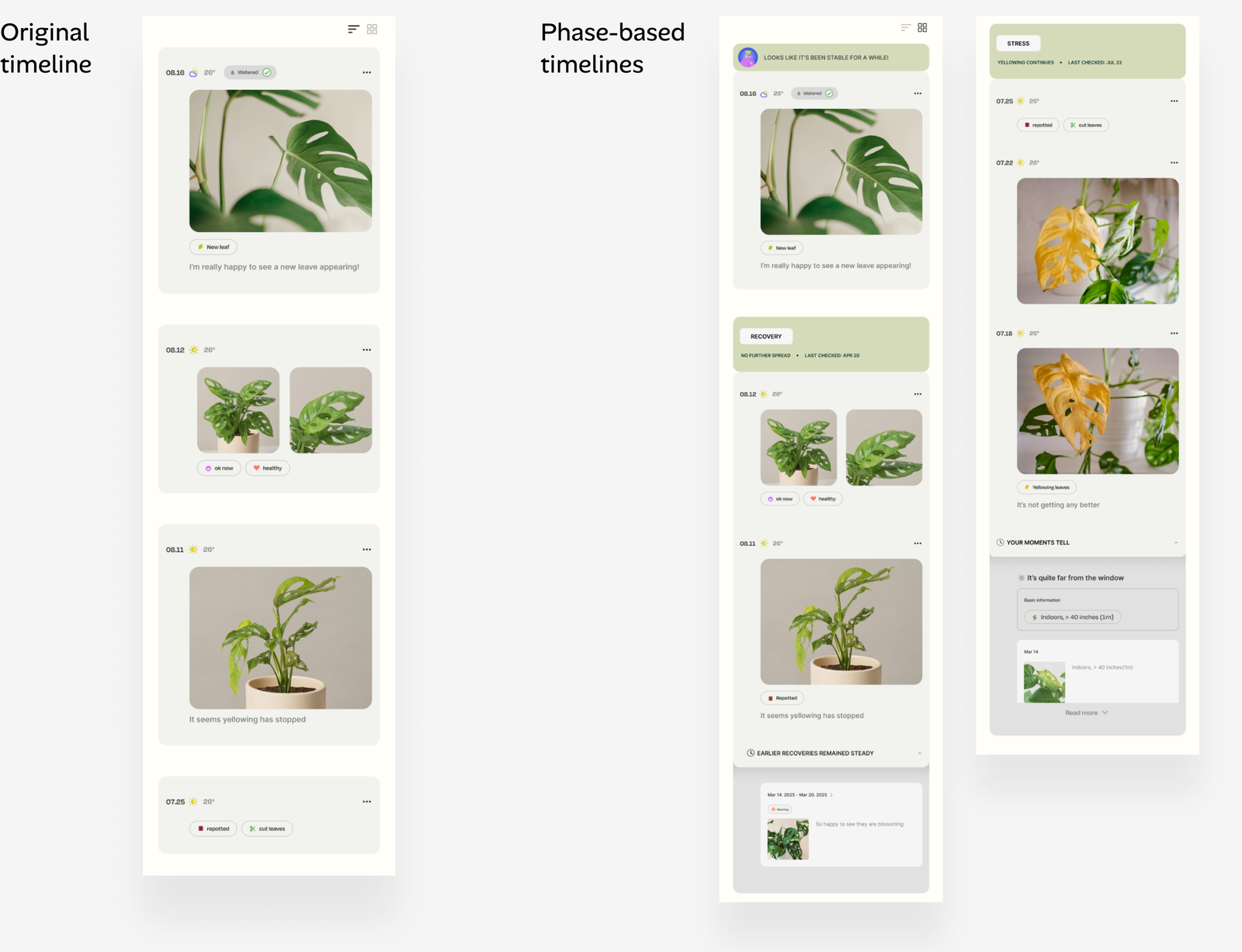
I created phase-based timelines to better support the idea of observation over time. While the original timeline keeps all the individual moments, the phase-based timelines organizes those moments into phases, like stress, stability or recovery. It also brings relevant previous moments into stories, so users can understand what’s happening now in context. So I wanted to see if this added enough value beyond the original timeline.
Participants liked both, which showed me that each view offered a different way to understand their plant’s history. So I kept both views and let users switch between them, since each offered a different kind of value.
Design decision & Iteration
Co-observing Layer
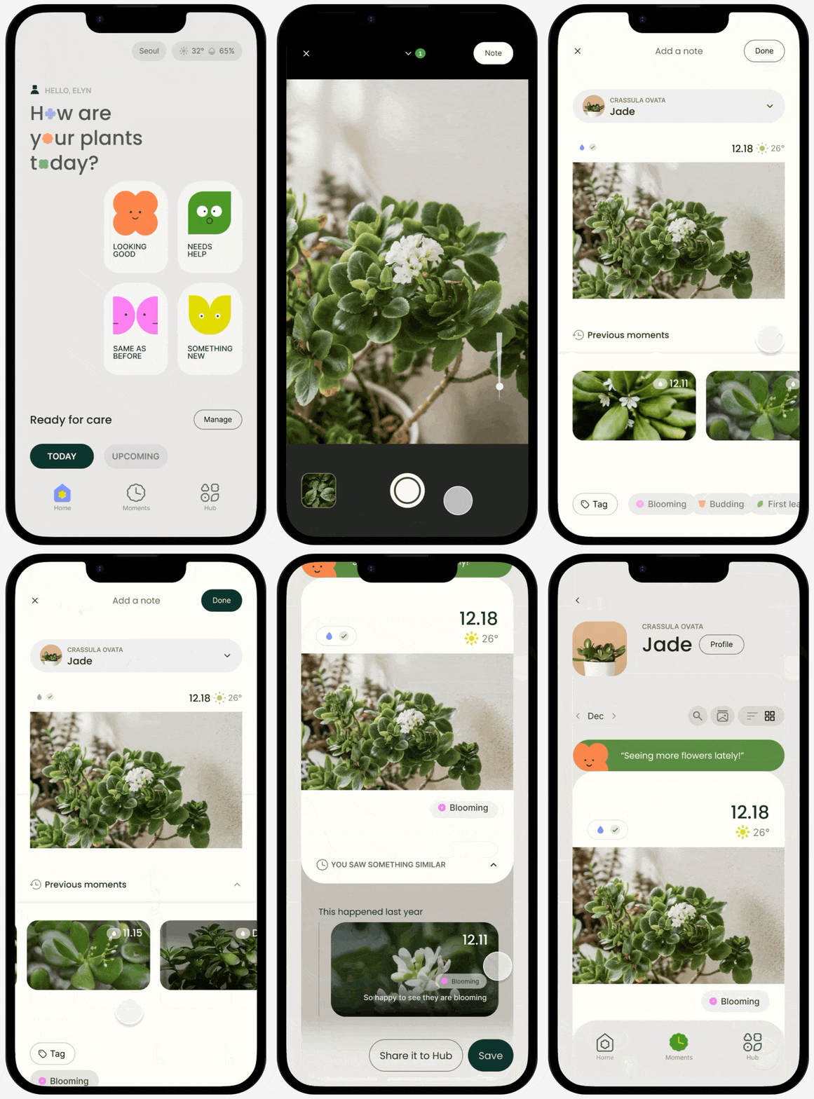
Looking good
Need help
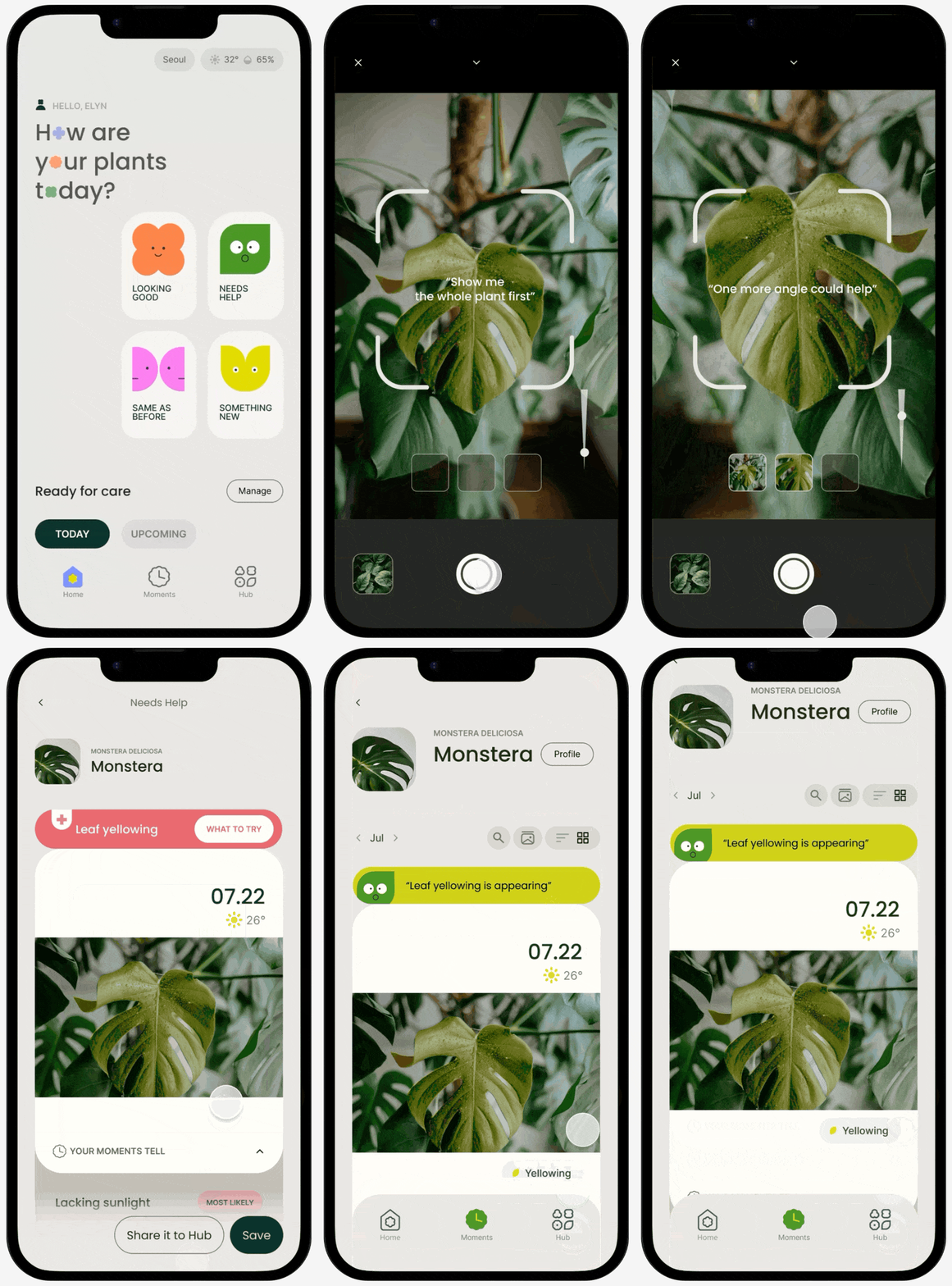
To make plant care feel less overwhelming, especially for beginners who worry about making mistakes, I created co-observing companions.
They appear at key decision points on the home screen, creating the feeling of observing the plant together. Before recording a story, users choose from four common situations—Looking good, Need help, Something new, or Same as before—giving them a simple starting point for what to observe and record.
Plant Current State
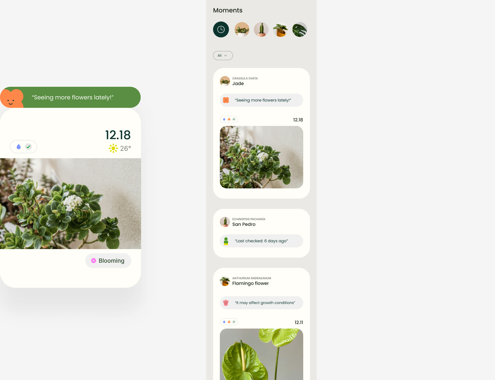
When users record a story, the system creates a plant state based on their inputs and system signals.
This state appears on both the Plant page and the Moments page, helping users quickly see their plant’s current condition and pick up where they left off after being away for a while.
Card system
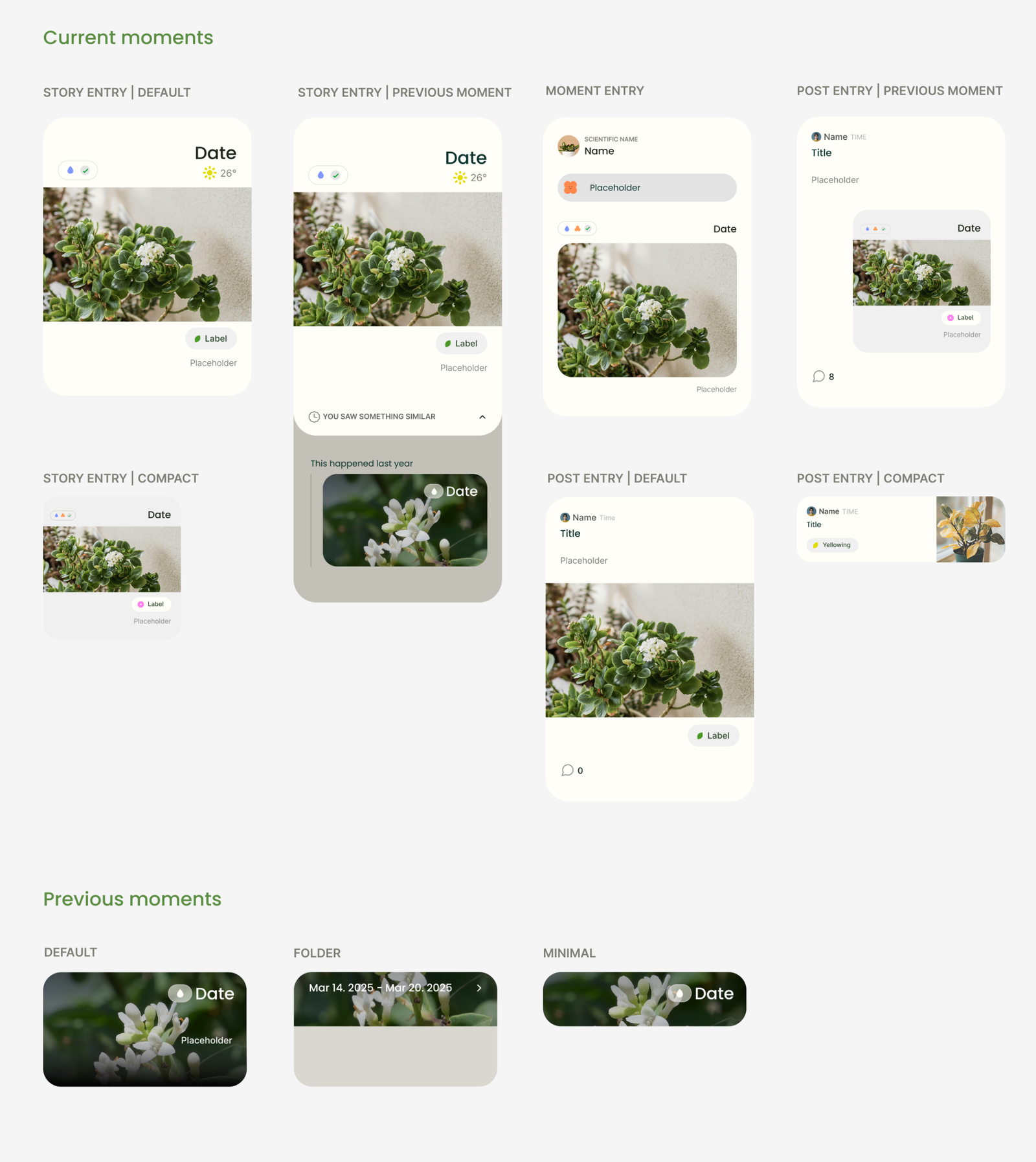
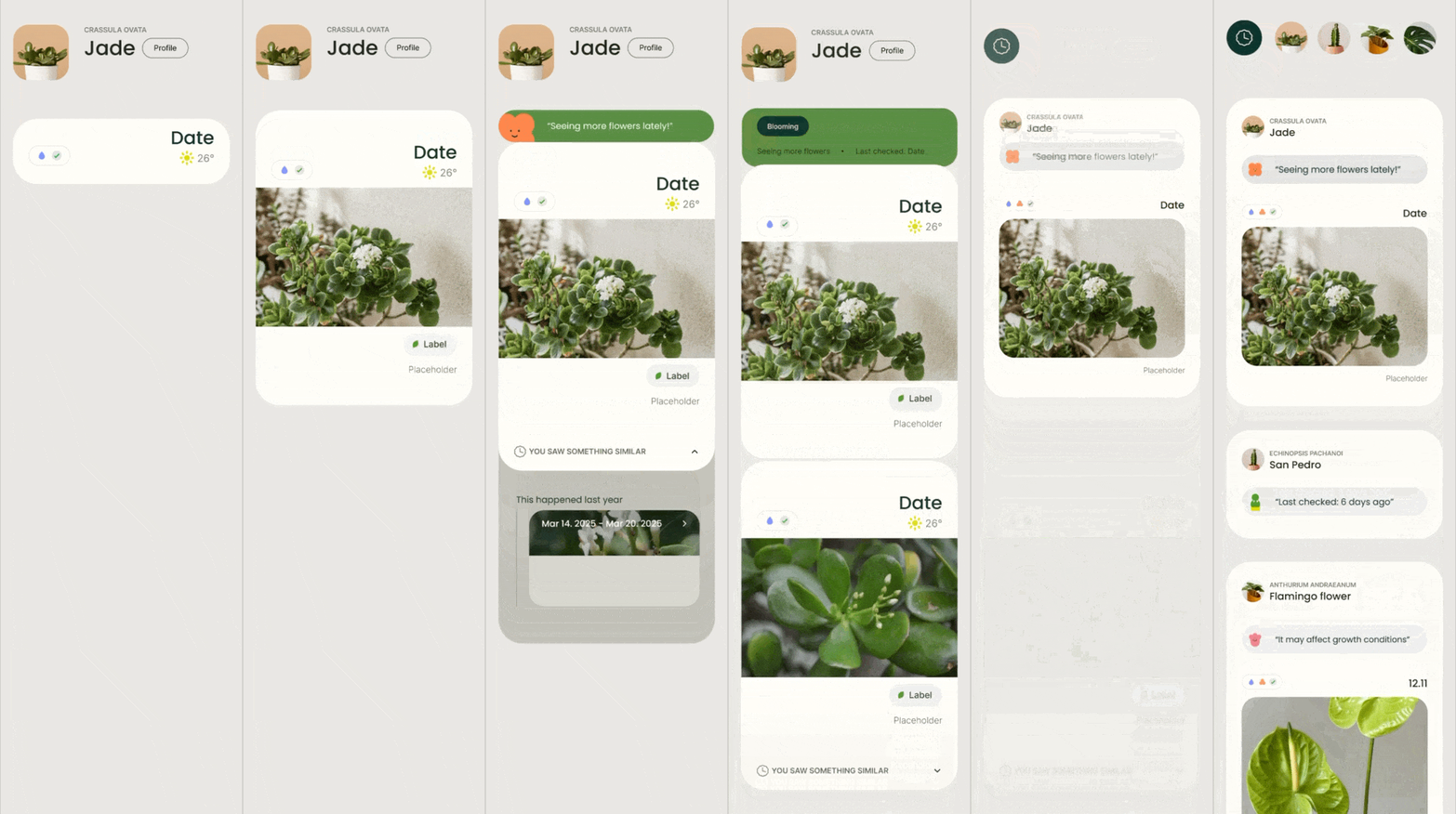
I wanted the current state and previous moments to feel like one continuous history. The current state appears first, while previous moments expand within the same card structure. This lets users move between past and present naturally, without feeling like they’re switching to a different part of the app.